Hello!👋
I’m Ozi Stephen, a Product & UI/UX Designer
With expertise gained from over 8 years, I transform businesses by creating intuitive, user-centered UI/UX designs that drive engagement and growth
UI/UX DESIGN, PRODUCT DESIGN
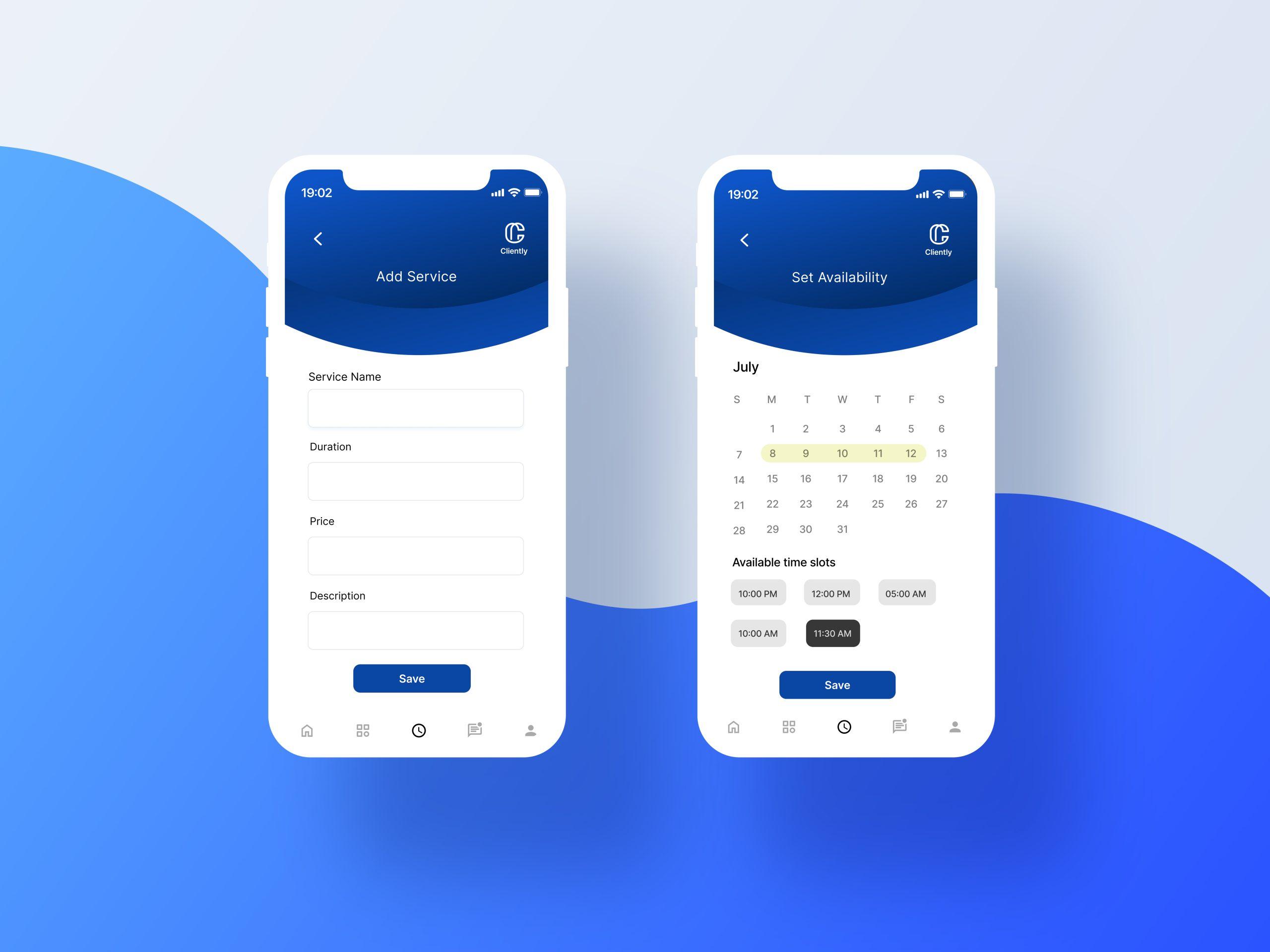
Cliently – Book clients. Get paid. No stress.
Designed a mobile-first SaaS app to streamline client booking and payments for solo service providers — empowering users to set availability, manage sessions, and get paid with ease.
MY PROJECTS
UI/UX DESIGN, PRODUCT DESIGN
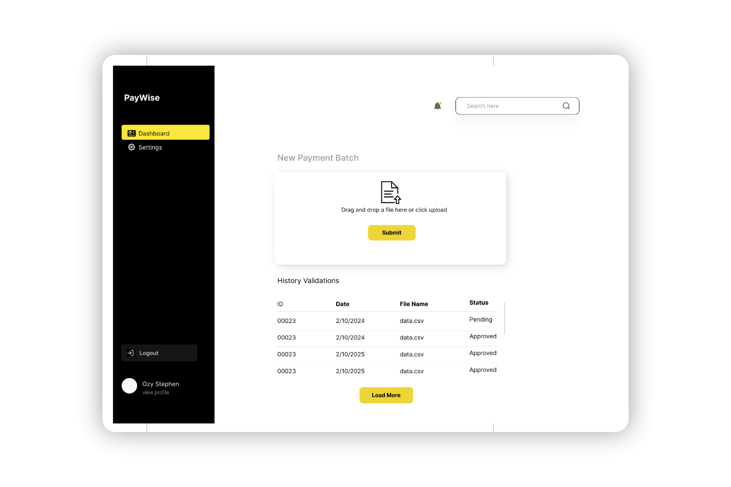
Paywise – Real-Time Bulk Payment Validation
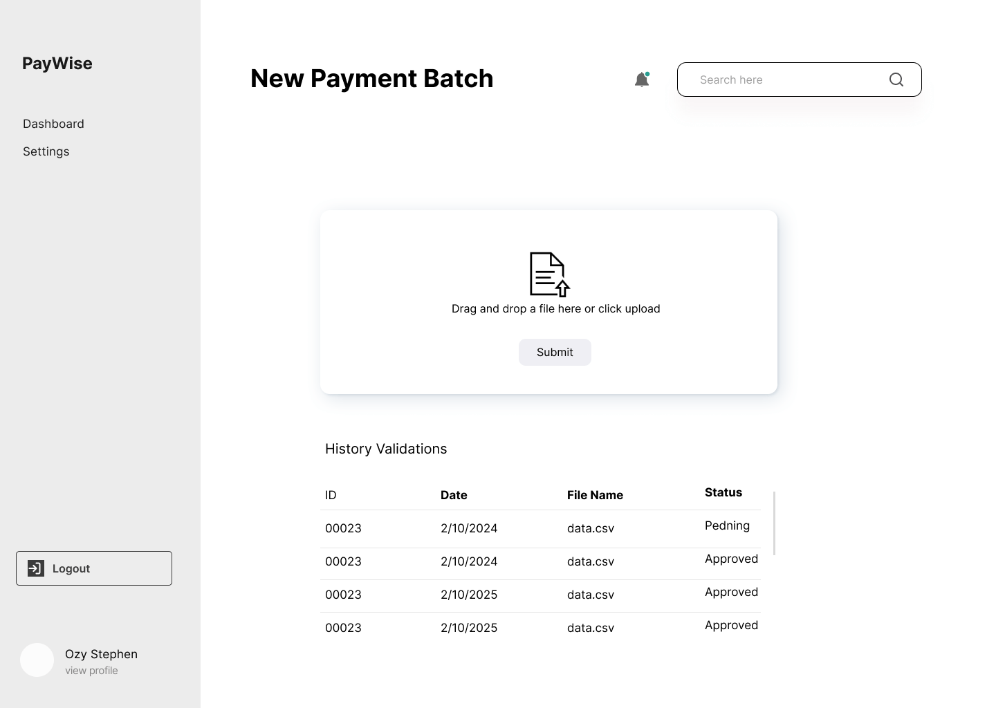
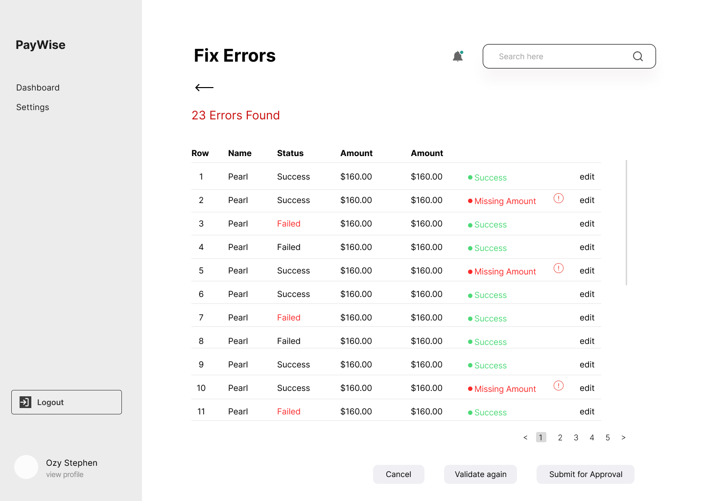
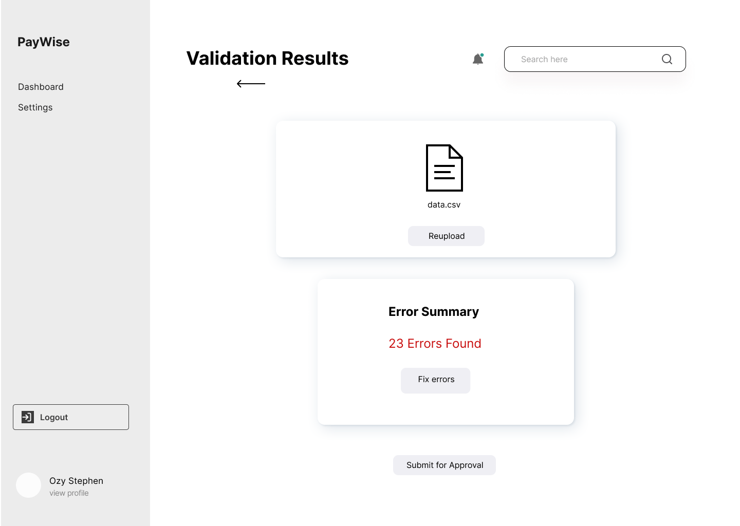
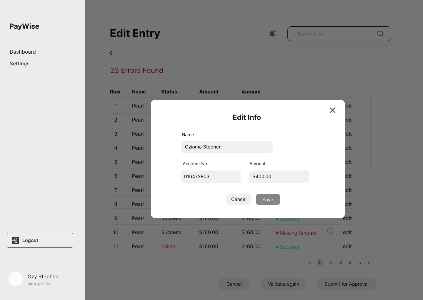
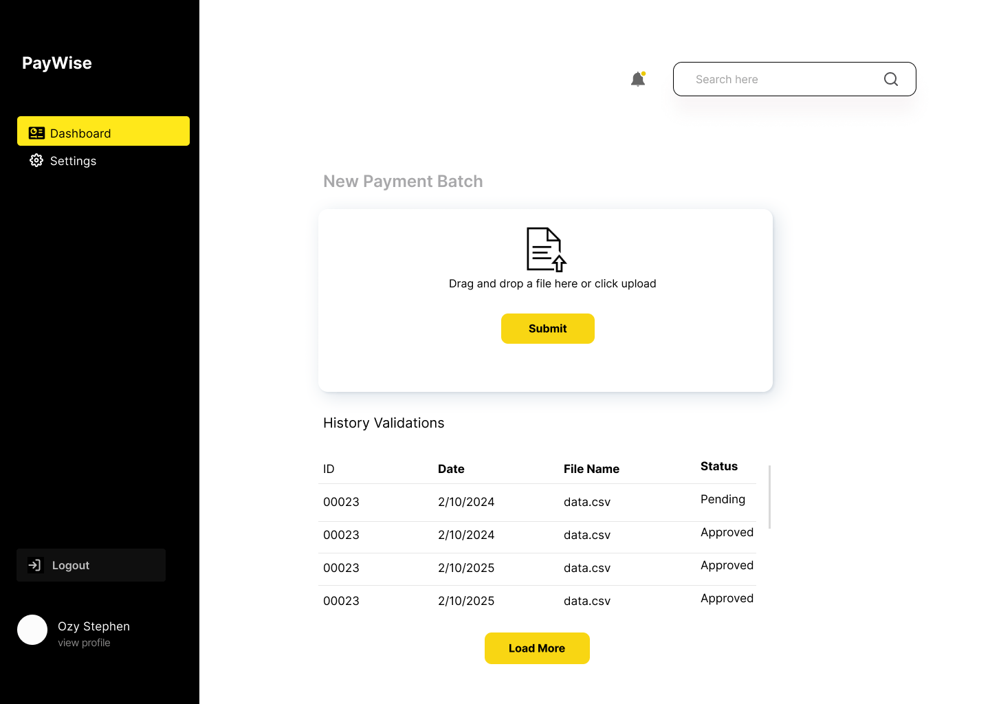
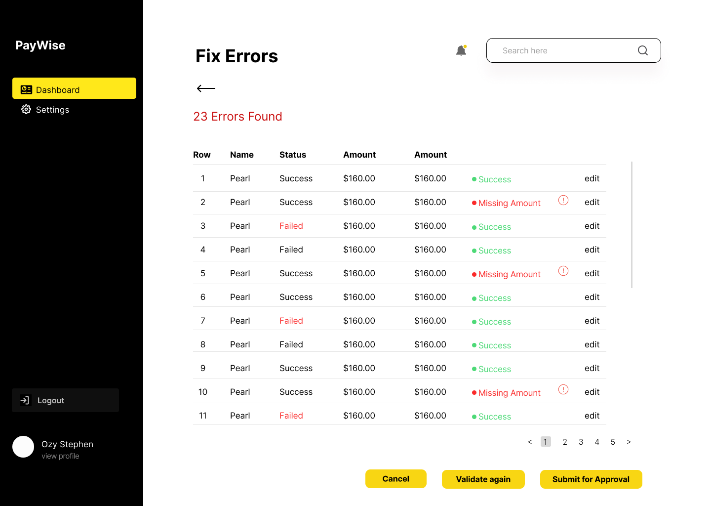
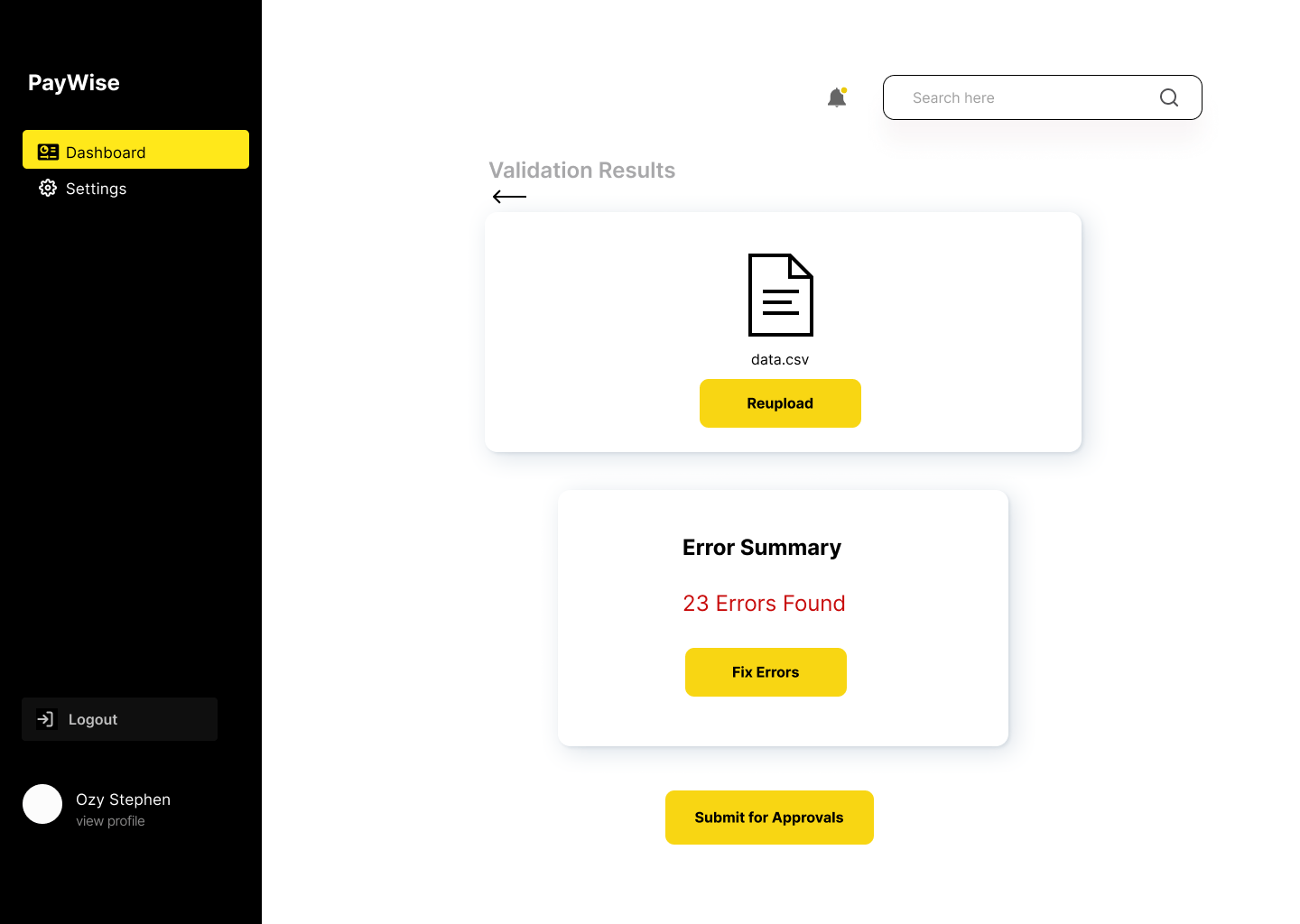
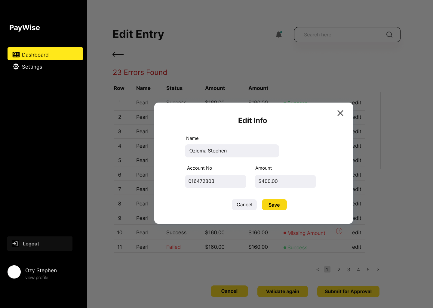
Redesigned a finance tool to validate bulk payment files in real time—replacing a 2-day error cycle with instant, editable feedback, streamlined approvals, and a more transparent payment workflow.
UI/UX DESIGN
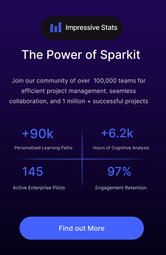
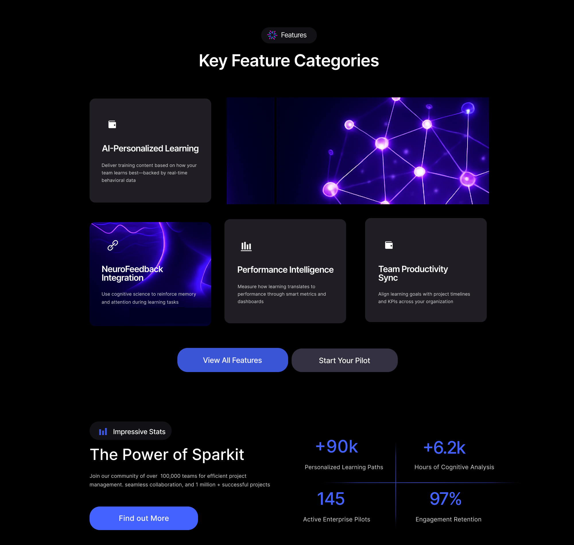
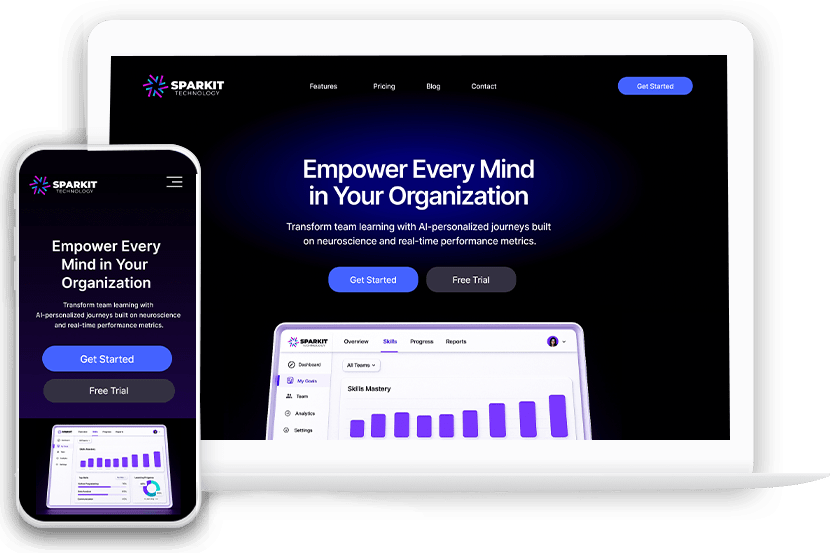
Sparkit – SaaS Landing Page Design
Crafted a clean, science-driven landing page for an AI learning platform—designed to simplify complex tech, build credibility, and accelerate enterprise adoption.
UI/UX DESIGN
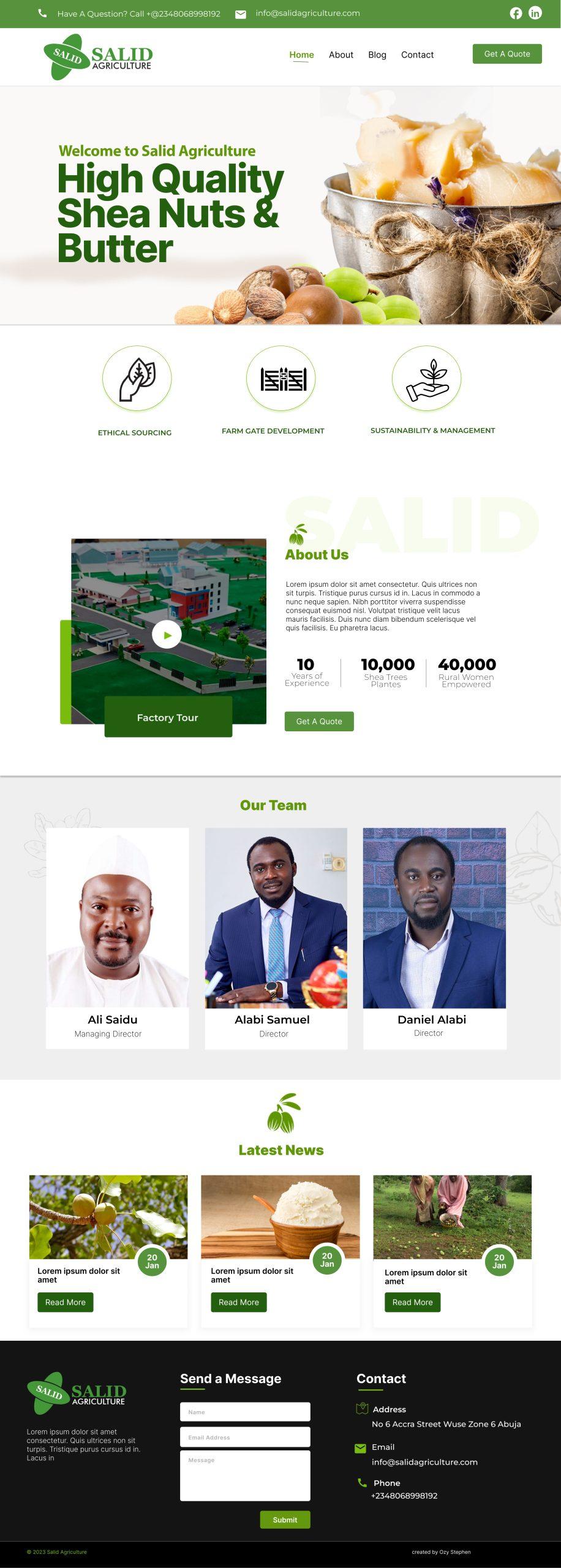
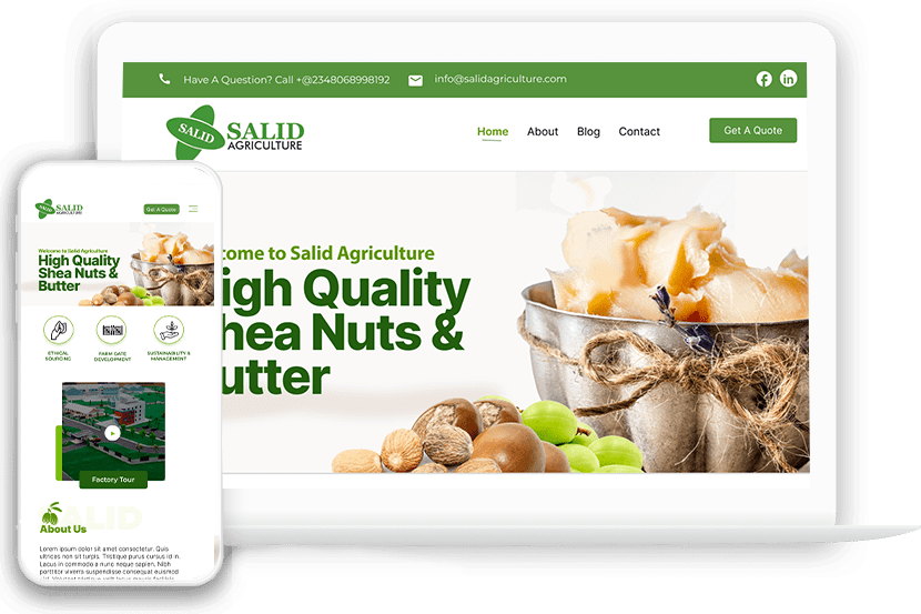
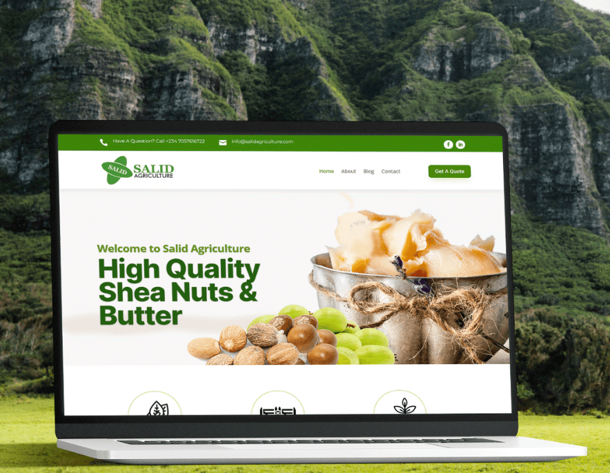
Salid Agriculture Website Redesign
Redesigned an agribusiness website to reflect trust and social impact—replacing an outdated layout with a clean, responsive experience that drives partner engagement and credibility.
Cliently – The Service Provider’s Booking Best Friend
CLIENT
- Cliently
PROJECT DURATION
- 4 Weeks
PLATFORM
- SaaS Mobile App
ROLE
- Product & UI/UX Designer
TEAM
- 1 UI/UX and Product Designer
- 12+ Developer
TOOLS USED
- Figma
- Hand Sketch
- FigJam
- Notion
- Lucide Icons
- Adobe Photoshop
- Adobe Illustrator
- Zeplin
- Notion
THE GOAL
Design a mobile-first SaaS app that empowers solo service providers to easily manage client bookings, availability, and payments — all from one app.
THE CHALLENGE
Many solo service providers like wellness coaches, makeup artists, and freelancers still manage bookings manually — through Instagram DMs, WhatsApp, Google Calendar, and bank transfers. This leads to:
-
Missed appointments
-
Payment delays
-
Double bookings
-
Mental stress
They need a simple, mobile-first tool to automate the entire flow: discovery → booking → payment → reminders → rebooking.
DISCOVERY & RESEARCH
To better understand the needs of solo service providers, I conducted 1:1 interviews with three individuals working in wellness, design, and beauty. Each shared how they currently manage bookings, communicate with clients, and handle payments.
Key themes emerged:
-
Most rely on a mix of DMs, messaging apps, and calendar tools
-
Payment tracking is disorganized, with frequent delays
-
There’s a strong desire for automation, especially around reminders and availability
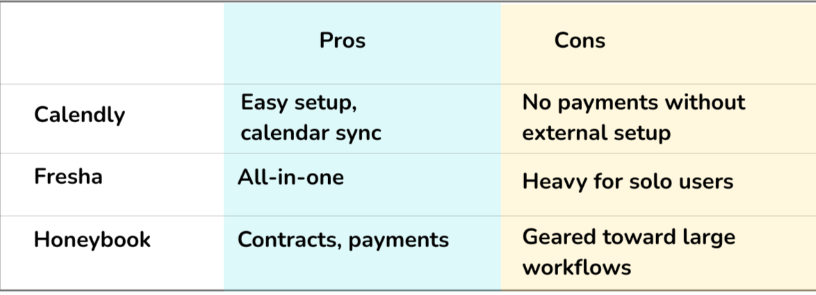
Competitor Review
Insight:
There’s a gap between simplicity and completeness. Cliently fills that gap — mobile-first, clean, and efficient.
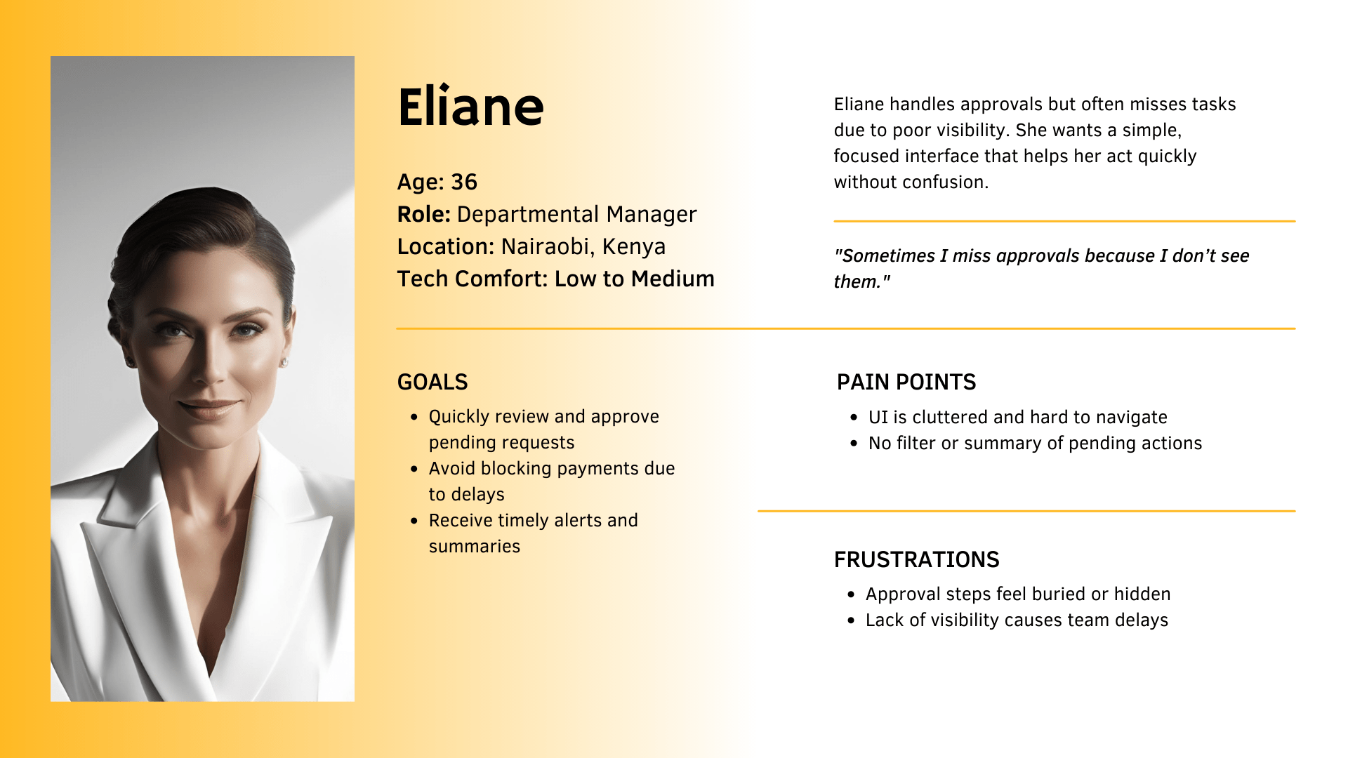
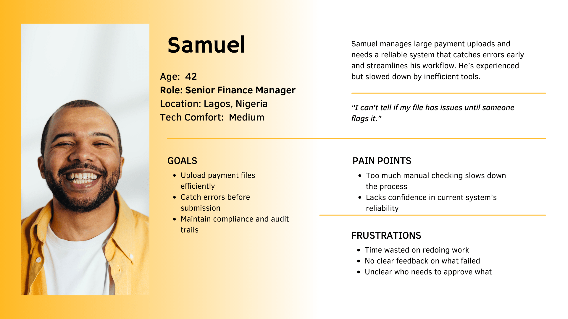
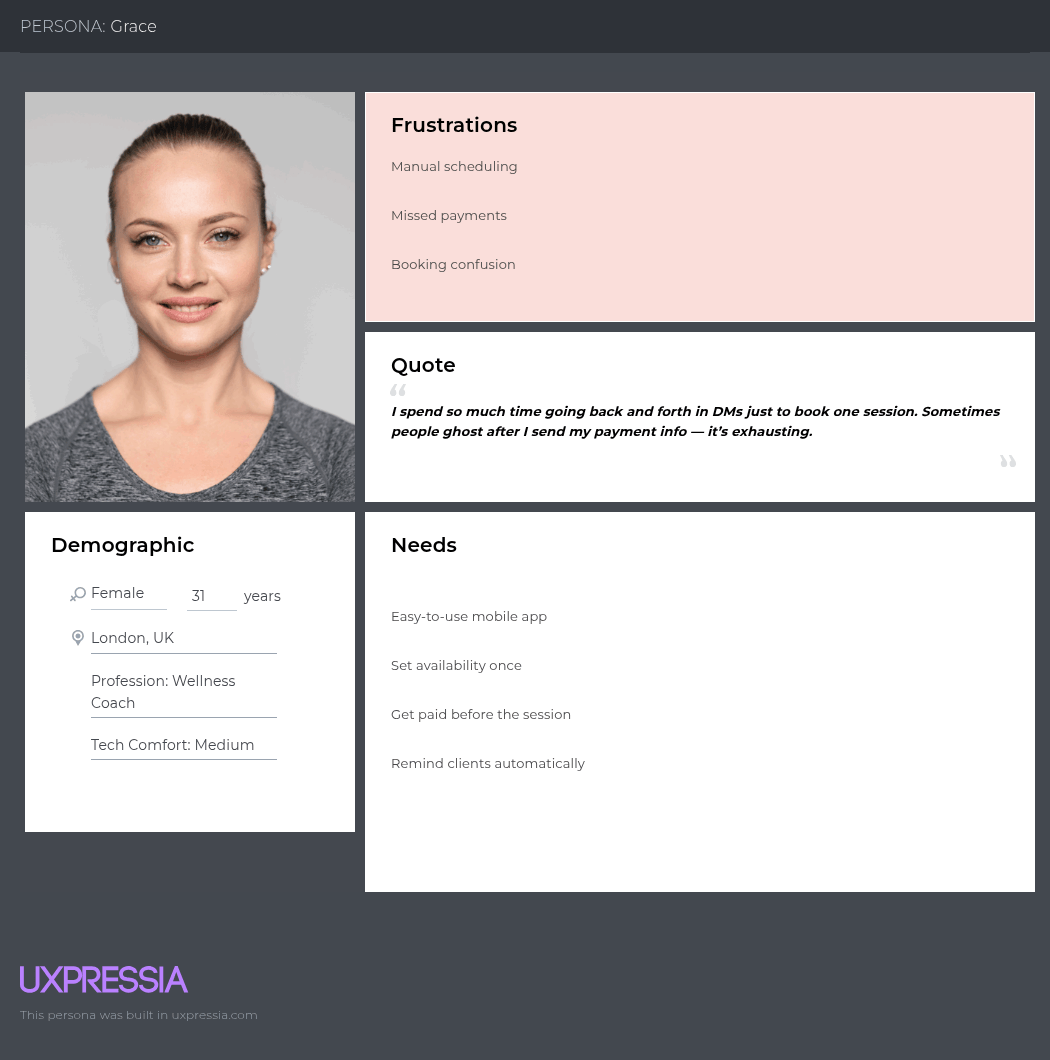
USER PERSONA (BUILDING EMPATHY)
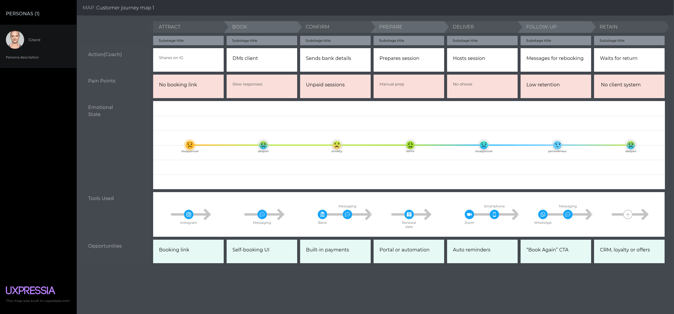
USER JOURNEY MAP
JOBS-TO-BE-DONE (JTBD)
-
When I share my services, I want a booking link to avoid chats.
-
When a client books, I want payment up front to avoid chasing them.
-
When a session nears, I want automatic reminders to reduce no-shows.
-
When I check my dashboard, I want to see upcoming sessions clearly.
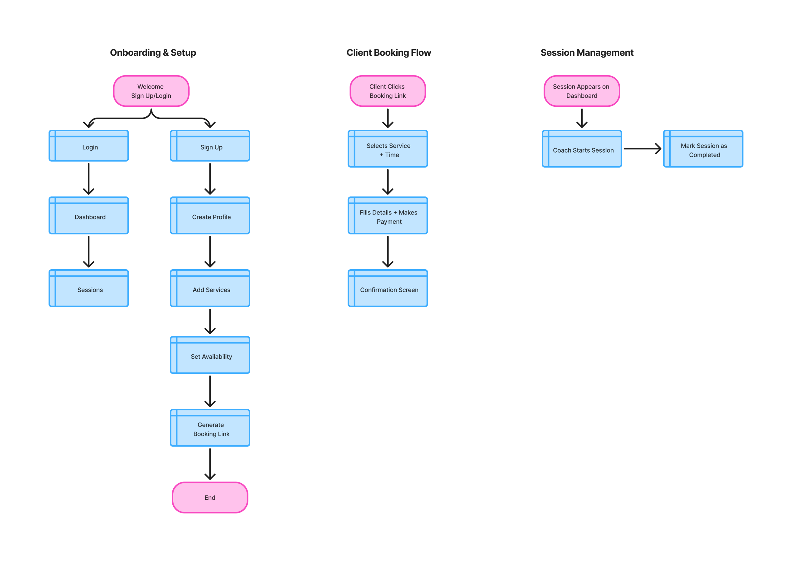
UX FLOW
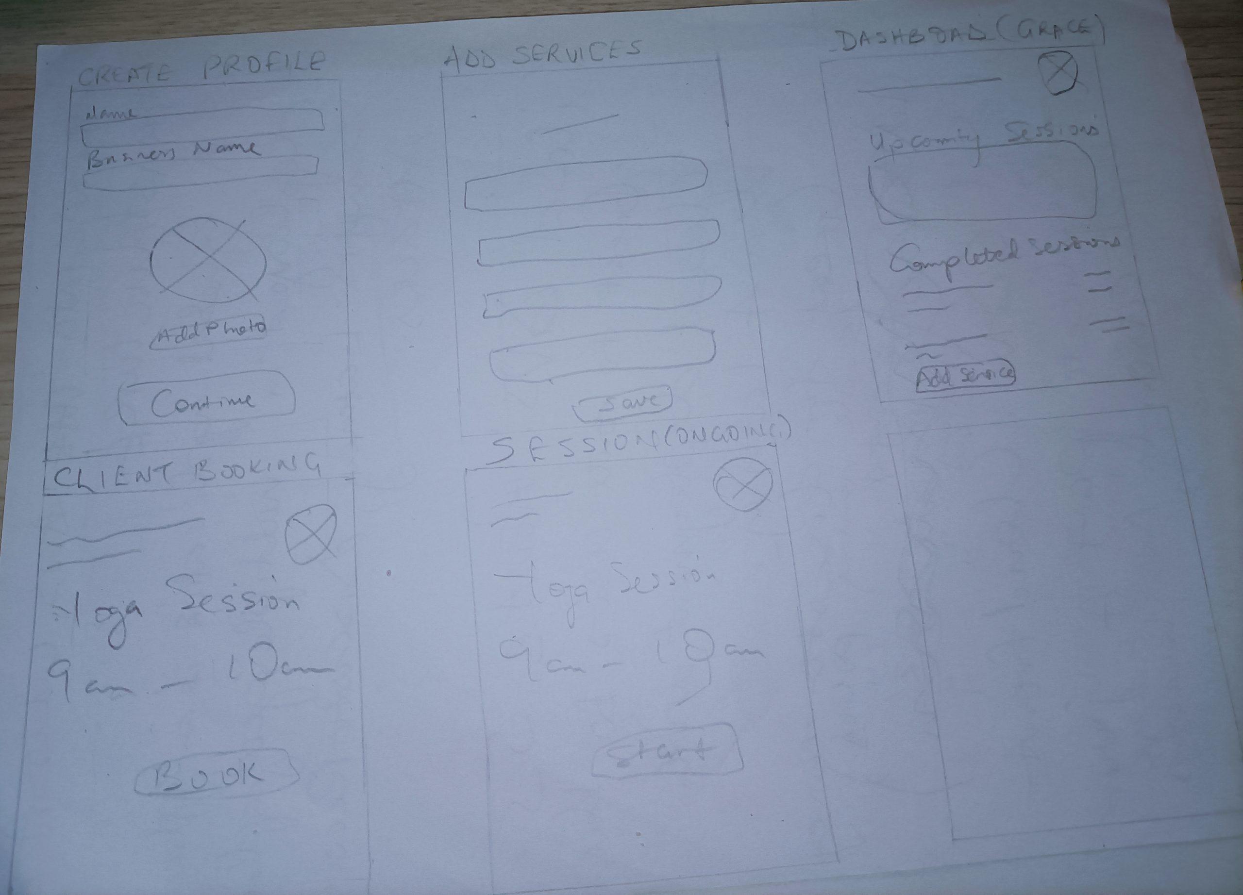
Wireframes
Created low-fidelity wireframes for:
“I prioritized clarity and hierarchy over early aesthetics.”
Style & Imagery

#3B7D3B

fed411

#2E2545

#FFFFFF
Built a functional, clickable prototype in Figma.
Click here to view Figma prototype
-
Simulates real flows
-
Mobile transitions
-
Payment success flow
-
Client-side booking journey
OUTCOME
“Cliently helped me practice designing a product from a real user lens, focusing on simplicity, flow, and purpose. It reminded me that value doesn’t come from complexity — but from reducing friction.”

View Figma File
Paywise: A Bulk Payments Dashboard for Fast, Accurate Finance Workflows
CLIENT
- Paywise (Enterprise Finance Tool)
PROJECT DURATION
- 5 Weeks
PLATFORM
- Desktop Web App
ROLE
- End-to-end UI/UX Design
TEAM
- 1 UI/UX Designer
- 1 VP of Product Manager
- 10+ Developer
TOOLS USED
- Figma
- Hand Sketch
- FigJam
- Adobe Photoshop
- Adobe Illustrator
- Zeplin
- Notion
Paywise is an enterprise dashboard designed to streamline the bulk payment process for finance teams. Legacy systems often forced users to manually upload large files, hunt for errors, and manage approvals without clear visibility. This project focused on redesigning the experience with modern UX principles—introducing intuitive data validation, real-time approval tracking, and a modular UI system to reduce friction and improve accuracy.
I led the end-to-end UI/UX design process: from user research and journey mapping to wireframes, prototyping, and usability testing—delivering a solution that was faster, clearer, and more scalable for enterprise needs.
THE CHALLENGE
Finance teams in large organizations regularly process bulk payments involving hundreds to thousands of transactions. Their existing tools were outdated, clunky, and prone to user error—especially during data uploads and approval workflows.
Key challenges included:
-
Manual file uploads with no error feedback until after submission
-
Lack of visibility into payment statuses and approval stages
-
Confusing user flows, especially for non-technical users
-
High error rates due to missing validations and unclear UI elements
The challenge was to redesign the bulk payments experience to be faster, more transparent, and error-resistant—without disrupting users’ existing mental models or workflows.
RESEARCH
To design a solution that addressed real user pain points, I began with a thorough discovery phase focused on understanding how finance teams process bulk payments today, where they struggle, and what they truly need.
🗨️ Stakeholder Interviews
I conducted 5 interviews with finance managers, payment approvers, and operations staff across mid-to-large organizations. Key findings included:
-
File uploads were prone to silent errors — users wouldn’t know something failed until long after submission.
-
Approvers had no single view of what needed their attention, often relying on emails or spreadsheet filters.
-
Users feared making irreversible mistakes, especially when working with large volumes.
📊 User Survey
A short survey was distributed to 20+ professionals in finance roles.
-
80% of users had experienced at least one payment rejection due to formatting issues.
-
65% said they lacked confidence in their approval system.
-
90% wanted clearer visibility and error feedback.
🕵️♂️ Competitive Analysis
I reviewed tools like Bill.com, SAP Concur, and QuickBooks to benchmark best practices and UX gaps.
| Tool | Strengths | Weaknesses |
|---|---|---|
| Bill.com | Reliable API integrations | Overly complex UI for bulk tasks |
| SAP Concur | Enterprise-ready workflows | Steep learning curve |
| QuickBooks | Familiarity & simplicity | Limited support for bulk actions |
Discover
Interviewed users and reviewed compeitiors to understand pain points in the legacy bulk payment process
Define
Identified key UX issues like lack of feedback, porr visibility and approval confusion. Created user personas
Ideate
Sketched flows and concepts for real-time validation, iline error fixing, and streamlined approvals
Design
Built modular wireframes and prototypes in figma, focused on speed, clarity, and role-based workflows
Test & Iterate
Ran usabilty tests, gathered feedback, and refined UI copy, layouts, and components to improve clarity
Deliver
Finalized high-fidelity UI, delivered annotated specs, and supported implementation through QA
1. Define: Synthesizing Research into Focus
After gathering insights through stakeholder interviews, user surveys, and competitive analysis, I distilled the core challenges into focused design goals:
-
Minimize upload errors through real-time data validation
-
Increase transparency with a clear view of approval status and priorities
-
Reduce user friction by simplifying workflows for both technical and non-technical users
-
Preserve familiarity to reduce cognitive load for users accustomed to legacy systems
These goals framed every design decision that followed.
2. Ideate: Mapping Out the Solution
With clear user needs in mind, I began shaping the solution:
-
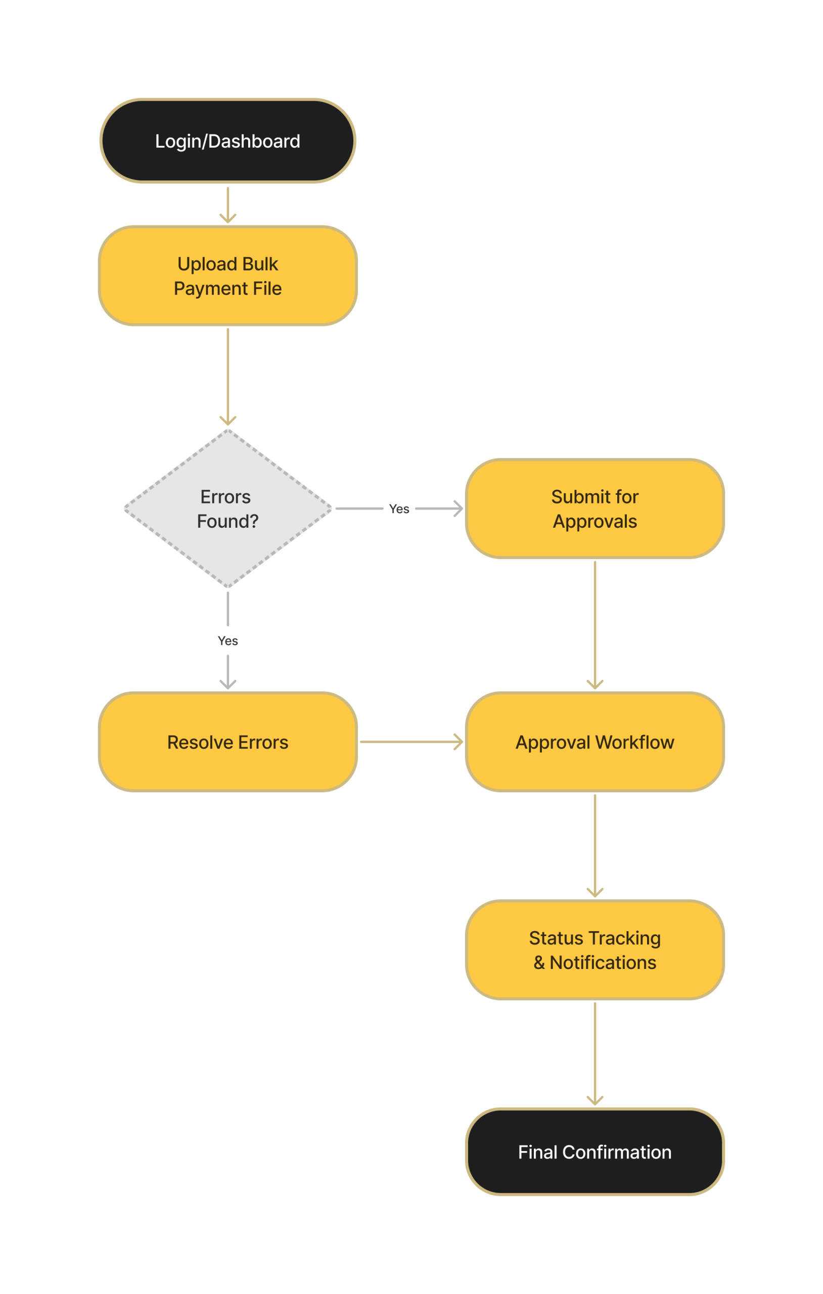
User Flows: I mapped out key user flows—such as uploading files, resolving errors, and approving payments—to identify redundancies and bottlenecks.
-
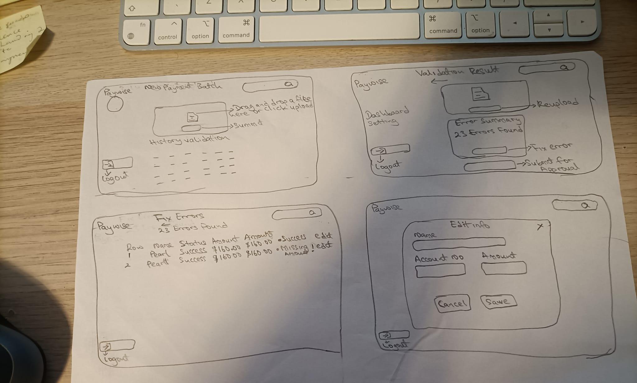
Sketching: Early hand-drawn sketches helped explore different interaction models, especially for complex areas like inline error resolution and multi-step approvals.
-
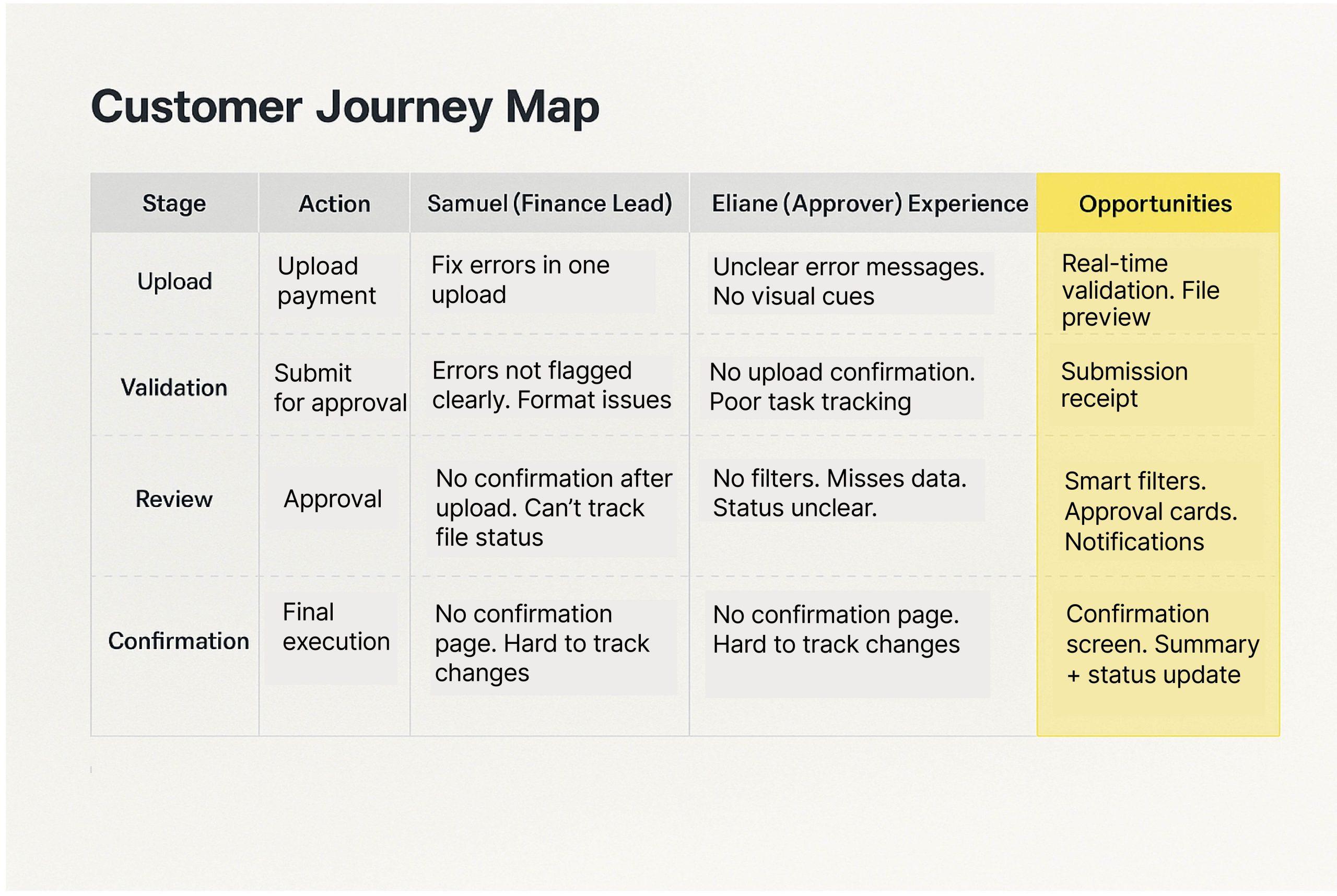
Journey Mapping: I visualized the full end-to-end user experience across roles (e.g., uploader vs. approver) to surface emotional highs/lows and system gaps.
3. Structure: Wireframes and IA
To ensure clarity and scalability:
-
Wireframes: I created low- to mid-fidelity wireframes to structure pages such as:
-
The bulk upload module with inline error handling
-
Approval dashboards with real-time status indicators
-
Notification systems and escalation paths
-
-
Information Architecture: I introduced a modular layout that allowed finance teams to toggle between batch views, approvals, and error logs seamlessly—reducing clutter and cognitive overload.
4. Prototype: Bringing the Experience to Life
I developed interactive prototypes in Figma to simulate real user scenarios. These prototypes focused on:
-
Immediate file validation feedback
-
A multi-level approval system with activity trails
-
Contextual error messages with actionable next steps
This allowed me to test not just static layouts, but also how the system behaved in real usage.
5. Test & Iterate: Validating with Real Users
To refine the design:
-
Usability Testing: I conducted 1:1 usability tests with 8 finance professionals using the prototype. They were tasked with uploading files, identifying errors, and completing approvals.
-
Key Findings:
-
Users appreciated inline error feedback that didn’t require jumping between screens.
-
The real-time approval dashboard significantly reduced reliance on email or spreadsheets.
-
Some terms and icons were unclear, leading to microcopy and iconography updates.
-
Iterations were made quickly in response to this feedback to strengthen usability and reduce ambiguity

View Figma File
6. Deliver: Ready for Development
-
High-Fidelity Designs: I finalized polished UI screens aligned with Paywise’s design system, optimizing for enterprise scalability and accessibility.
-
Developer Handoff: Delivered annotated designs and interaction specs via Figma and Zeplin. Also supported QA to ensure design integrity in implementation.
OUTCOME
The redesigned Paywise experience transformed a previously clunky, error-prone system into a modern, efficient tool tailored for enterprise finance teams.
Key Improvements:
-
90% reduction in upload-related errors, thanks to real-time validation and clearer feedback
-
Significant time savings for approvers by introducing a centralized dashboard for pending actions
-
Improved user confidence—finance managers reported feeling “more in control” and less reliant on external tools like spreadsheets or email threads
-
Faster onboarding for new users due to simplified workflows and more intuitive UI patterns
These changes helped increase adoption across teams and reduced reliance on workaround tools, improving operational efficiency across the payment lifecycle.
CONCLUSION
Designing Paywise was an opportunity to solve real, high-stakes problems for users managing thousands of transactions daily. This project challenged me to:
-
Balance enterprise complexity with UX simplicity
-
Make invisible processes—like approvals and file errors—more transparent and human-friendly
-
Work cross-functionally with stakeholders and developers to ensure accuracy and alignment in a high-risk financial environment
More than anything, this experience reinforced the value of designing with empathy and precision—especially in enterprise contexts where clarity and trust are non-negotiable.
Redesigning Salid Agriculture’s Website for Trust, Clarity, and Growth
CLIENT
- Salid Agriculture
PROJECT DURATION
- 2 Weeks
PLATFORM
- Desktop & Mobile
TEAM
- 1 UI/UX Designer
- 1 Web Designer
TOOL
- Figma
- Hand Sketch
- FigJam
- Adobe Photoshop
- Adobe Illustrator
Project Info
Challenge
Salid Agriculture’s website lacked structure, clarity, and modern design. It failed to communicate the brand’s social impact and credibility, making it difficult for partners and investors to engage or trust the business online.
Solution
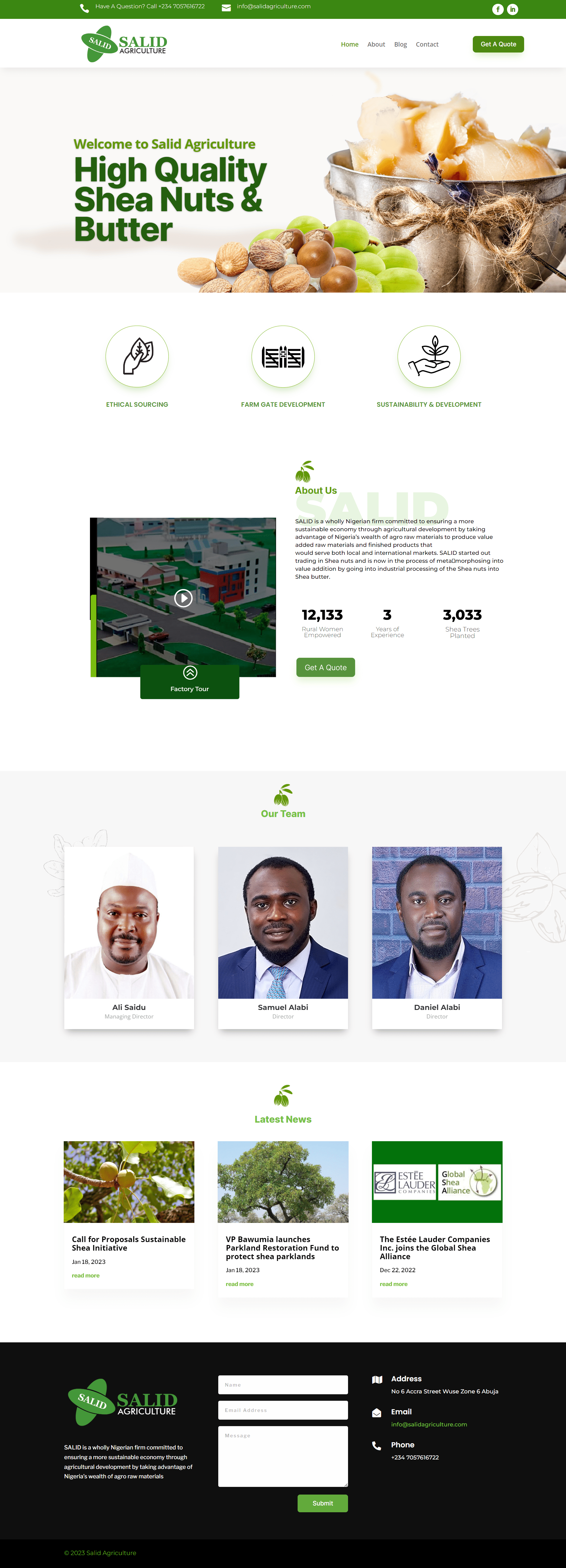
I redesigned the site with a clean, responsive layout, strengthened the brand’s voice through clearer messaging, and showcased key impact metrics and team credibility. The result is a trustworthy, user-friendly platform that supports engagement and growth.
My Process
Discover
Conducted a visual and content audit, reviewed competitors, and interviewed stakeholders to understand the goals and gaps in the old site.
Strategize
Mapped content hierarchy, defined UX goals, and aligned visual direction with the client’s brand, values, and audience needs.
Design
Created wireframes and high-fidelity UI screens using Figma, focusing on structure, clarity, and mobile responsiveness.
Deliver
Prepared final UI assets with annotated specs and collaborated closely with the development team to ensure design accuracy and implementation consistency.
AUDIT & RESEARCH
-
Visual Audit: Unaligned elements, inconsistent fonts, low-res images.
-
Content Audit: No clear hierarchy, too much text in wrong places.
-
Competitive Research: Compared with similar agribusiness brands in Africa and globally.
-
Client Interviews: Identified key business goals — trust, social impact, investor confidence.
UX GOALS
| Goal | UX Solution |
|---|---|
| Build trust | Hero section with strong imagery & impact stats |
| Tell the brand story | Clear “About Us” section and video feature |
| Humanize the business | Highlighted director profiles with images |
| Increase engagement | Repeated “Get a Quote” CTA and clear contact info |
| Simplify navigation | Clean header with sticky nav and intuitive sections |
UI IMPROVEMENTS
-
Visual Identity: Unified color palette (greens, naturals) and consistent fonts
-
Hero Banner: High-quality shea butter image and bold headline for instant message clarity
-
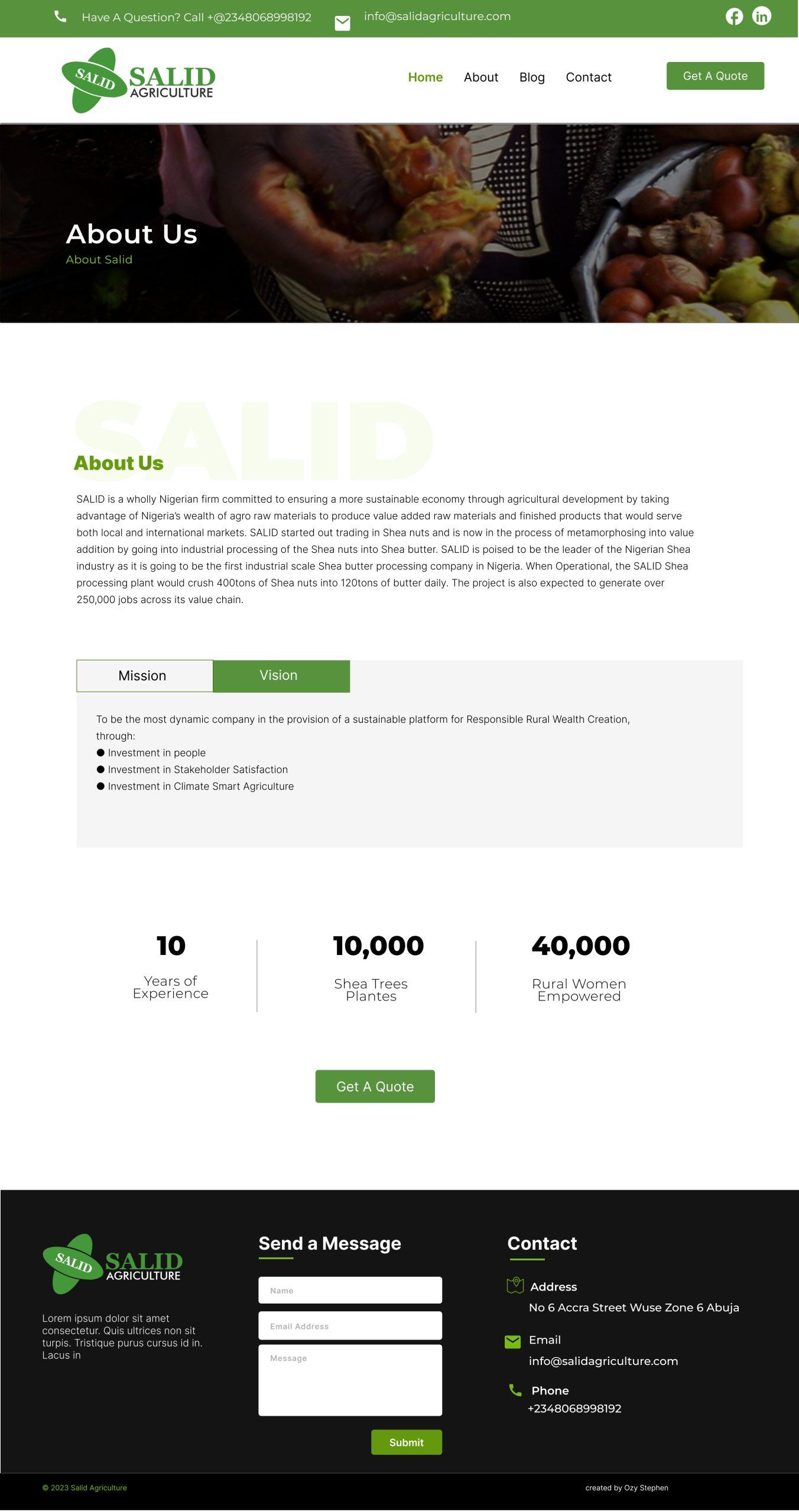
Impact Metrics: 10,000 trees, 40,000 women — made prominent below About section
-
Team Section: Added professional headshots and titles for trust
-
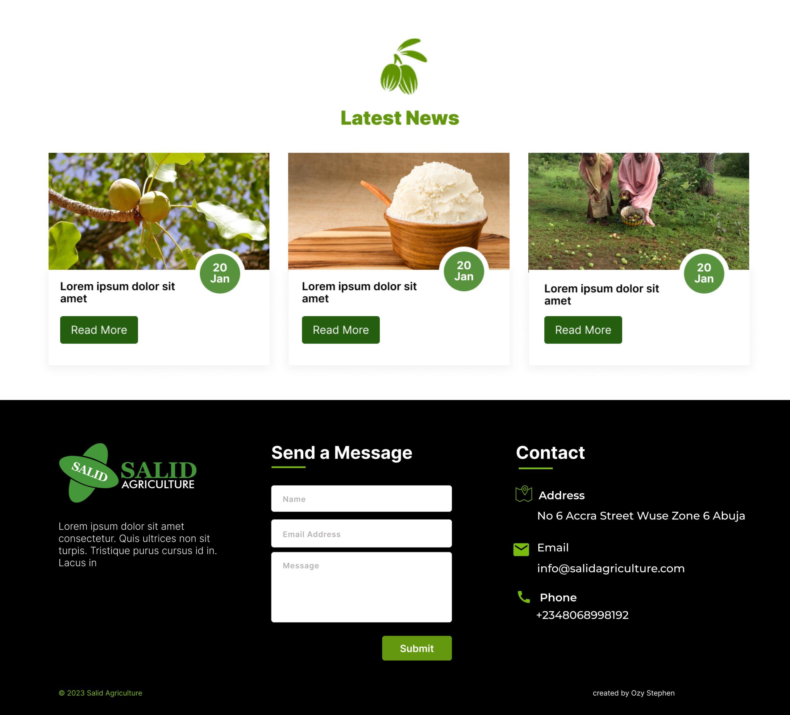
Latest News: Modular layout to support updates and SEO
Style & Imagery

#3B7D3B

#4CAF50

#2E2545

#FFFFFF


Aa
Inter Semibold 32pt
Inter Regular 24pt
Inter Regular 16pt
Inter Bold 14pt
We chose Inter for its high readability and modern aesthetic. Its geometric clarity and wide weight range make it ideal for both headings and body text across digital interfaces. The type scale balances visual hierarchy with clean spacing, ensuring content remains legible and accessible on all devices.
UI Blocks
DELIVERY: READY FOR DEVELOPMENT
-
High-Fidelity Designs: I finalized polished UI screens aligned with Paywise’s design system, optimizing for enterprise scalability and accessibility.
-
Developer Handoff: Delivered annotated designs and interaction specs via Figma and Zeplin. Also supported QA to ensure design integrity in implementation.

View Figma File
Main Pages
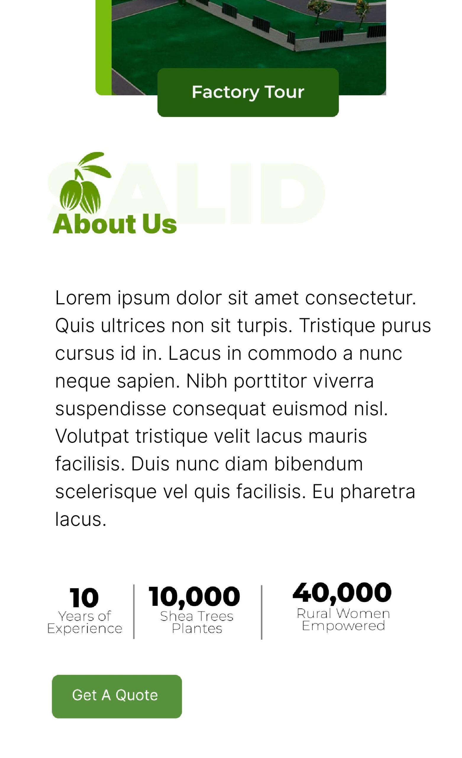
The redesigned pages focused on clarity, trust, and storytelling. The homepage highlights Salid’s mission, impact metrics, and key services, while the About page introduces the team and emphasizes the company’s credibility. A modular layout structure was used across all pages to ensure consistency and scalability. Special attention was given to mobile responsiveness and clean navigation to make the site accessible and engaging for all user types—investors, partners, and local stakeholders.
IMPACT
The new website helped Salid Agriculture build trust, clearly communicate its mission, and better engage with investors and partners. Key impact stats and team profiles added credibility, while the clean, mobile-friendly design improved usability and accessibility. The result is a more professional, trustworthy, and growth-ready online presence.
Sparkit – Landing Page Design for a New AI SaaS Product
OVERVIEW
Sparkit – An AI dashboard that transforms raw data into instant strategic insights
PROJECT DURATION
- 1 Week
TYPE
- Landing Page Design (Responsive Web)
TEAM
- 1 UI/UX Designer
- 1 Web Designer
TOOLS
- Figma
- Hand Sketch
- FigJam
- Adobe Photoshop
- Adobe Illustrator
GOAL
Design a marketing site that introduces Sparkit and converts first-time visitors to early users
Project Info
Challenge
How do you design a landing page that clearly communicates a new product’s value, builds user trust, and drives engagement — all in a single scroll?
Sparkit needed a clean, modern landing page that would:
Introduce the product and its core benefits
Establish a credible and distinctive brand presence
Guide users toward exploring the features or picking a plan
Set a strong design foundation for future product-facing UI
The challenge was to balance clarity, personality, and performance — designing something that works across devices, scales with the brand, and feels instantly trustworthy.
Design Goals
From discovery conversations with the founder, I defined these goals:
-
Communicate Sparkit’s core value in under 10 seconds
-
Establish a credible and modern brand feel
-
Design responsive sections that highlight features, pricing, and key actions
-
Build a visual system that can scale into product UI later
DISCOVERY & STRATEGY
Content Priorities
Using a simple card-sorting method, I outlined key content priorities:
-
Hero section with value prop + CTA
-
Features (grouped into categories)
-
Pricing comparison
-
Visual demo (mockups)
-
Social proof (future placeholder)
-
Footer with links + contact
VISUAL DIRECTION
The founder wanted something sleek, tech-forward, and slightly futuristic, but still readable and warm.

#3A5AFE

#7638FA

#2E2545

#FFFFFF

#A1A1A8
Aa
Inter Semibold 32pt
Inter Regular 24pt
Inter Regular 16pt
Inter Bold 14pt
We chose Inter for its high readability and modern aesthetic. Its geometric clarity and wide weight range make it ideal for both headings and body text across digital interfaces. The type scale balances visual hierarchy with clean spacing, ensuring content remains legible and accessible on all devices.
UI Blocks
Final Delivery
I delivered a polished, dev-ready design with clear documentation on layout, interactions, and assets. Everything was set up for easy handoff and scalable use as Sparkit grows. The final result: a landing page that builds confidence, communicates value quickly, and drives action from its very first users.

View Figma File
Main Pages
The newly designed landing page for Sparkit focused on simplifying a complex product through clarity, trust-building, and visual storytelling. The homepage introduces Sparkit’s core value—AI-powered learning rooted in neuroscience—while showcasing key features, success metrics, and flexible pricing plans. A modular layout ensures consistency and future scalability, and the visual design blends intelligence with approachability. Special attention was given to clean navigation, mobile responsiveness, and clear CTAs to engage enterprise users, team leads, and early adopters.
OUTCOME
MVP launch attracted 12 enterprise signups in 30 days with a 36% conversion from landing to demo request.
Designing Sparkit’s landing page from scratch helped me sharpen my storytelling, branding, and UX strategy skills. Working without user data pushed me to rely on design heuristics, content hierarchy, and strong visual systems to create a compelling experience.
I’m proud of the outcome—and excited to see how Sparkit evolves from here.
Redesigning Salid Agriculture’s Website for Trust, Clarity, and Growth
CLIENT
- Salid Agriculture
PROJECT DURATION
- 1 Month
PLATFORM
- Desktop & Mobile
TEAM
- 1 UI/UX Designer
- 1 Web Designer
TOOL
- Figma
- Hand Sketch
- FigJaam
- Adobe Photoshop
- Adobe Illustrator
Salid Agriculture is a socially-driven agribusiness empowering rural communities through sustainable shea butter production and ethical sourcing. As the brand grew, its digital presence fell behind—failing to reflect its impact, credibility, and professionalism.
This project focused on redesigning Salid Agriculture’s website from the ground up. The goal was not only to modernize the UI, but also to build trust with partners, investors, and customers through thoughtful user experience design. The result: a clean, responsive, and conversion-ready platform that amplifies Salid’s mission and makes their work visible to the world.
THE CHALLENGE
The original website:
-
Looked outdated and lacked visual appeal
-
Had poor structure and weak messaging
-
Didn’t communicate credibility or impact effectively
-
Was hard for users (and the client) to navigate or update
RESEARCH
-
Visual Audit: Unaligned elements, inconsistent fonts, low-res images.
-
Content Audit: No clear hierarchy, too much text in wrong places.
-
Competitive Research: Compared with similar agribusiness brands in Africa and globally.
-
Client Interviews: Identified key business goals — trust, social impact, investor confidence.
UX GOALS
| Goal | UX Solution |
|---|---|
| Build trust | Hero section with strong imagery & impact stats |
| Tell the brand story | Clear “About Us” section and video feature |
| Humanize the business | Highlighted director profiles with images |
| Increase engagement | Repeated “Get a Quote” CTA and clear contact info |
| Simplify navigation | Clean header with sticky nav and intuitive sections |
UI IMPROVEMENTS
-
✅ Visual Identity: Unified color palette (greens, naturals) and consistent fonts
-
✅ Hero Banner: High-quality shea butter image and bold headline for instant message clarity
-
✅ Impact Metrics: 10,000 trees, 40,000 women — made prominent below About section
-
✅ Team Section: Added professional headshots and titles for trust
-
✅ Latest News: Modular layout to support updates and SEO
DESIGN PROCESS
STYLE & IMAGERY
-
Typography: Clean, accessible sans-serif
-
Color Scheme: Green for growth/trust, white for clarity, black for contrast
-
Icons: Custom-styled line icons for services
-
Spacing & Grid: Improved whitespace for scan-ability
-
Sketching: Early hand-drawn sketches helped explore different interaction models, especially for complex areas like inline error resolution and multi-step approvals.
6. Deliver: Ready for Development
-
High-Fidelity Designs: I finalized polished UI screens aligned with Paywise’s design system, optimizing for enterprise scalability and accessibility.
-
Developer Handoff: Delivered annotated designs and interaction specs via Figma and Zeplin. Also supported QA to ensure design integrity in implementation.
IMPACT
-
Implemented the design using Divi with responsive behavior
-
Made sure images scale well across desktop and mobile
-
Delivered easy-to-edit modules so client could manage content without dev support
BUILD & HAND-OFF
-
✳️ Improved visual credibility, leading to better stakeholder engagement
-
✅ Easier for the client to update blog/news
-
🔗 Increased “Get a Quote” interactions (based on anecdotal client feedback)
-
🎯 Clearer storytelling led to better presentations for funding and partnerships
© 2024 Ozy Stephen. All rights reserved.
Privacy Policy

