Hello!👋
I’m Ozioma Stephen, a Multimedia Designer
UI/UX | Website | Graphics | Motion Design | Online Marketing
With over 10 years’ experience, I create clear, impactful digital experiences that help businesses grow.
I have been busy lately
Vogen Technologies
UI/UX, Website, Marketing Designs
Hennes Homes
Brand Identity | Website | Marketing Materials
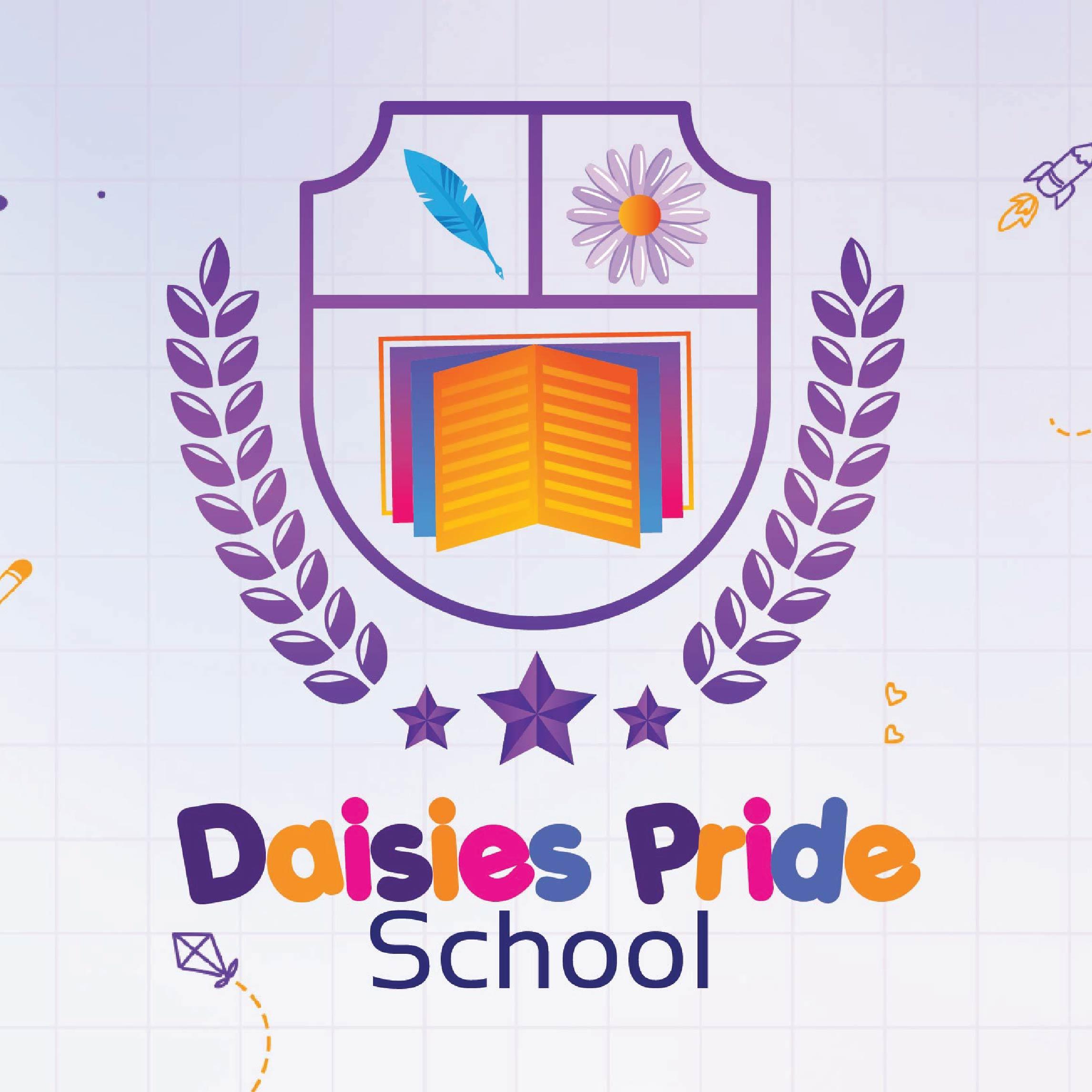
Daisies Pride School
Branding, UI/UX, Website, Marketing Design
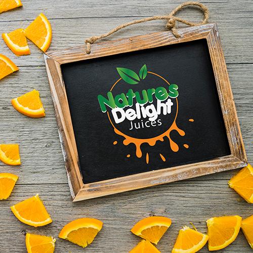
Nature's Delight Juices
Branding
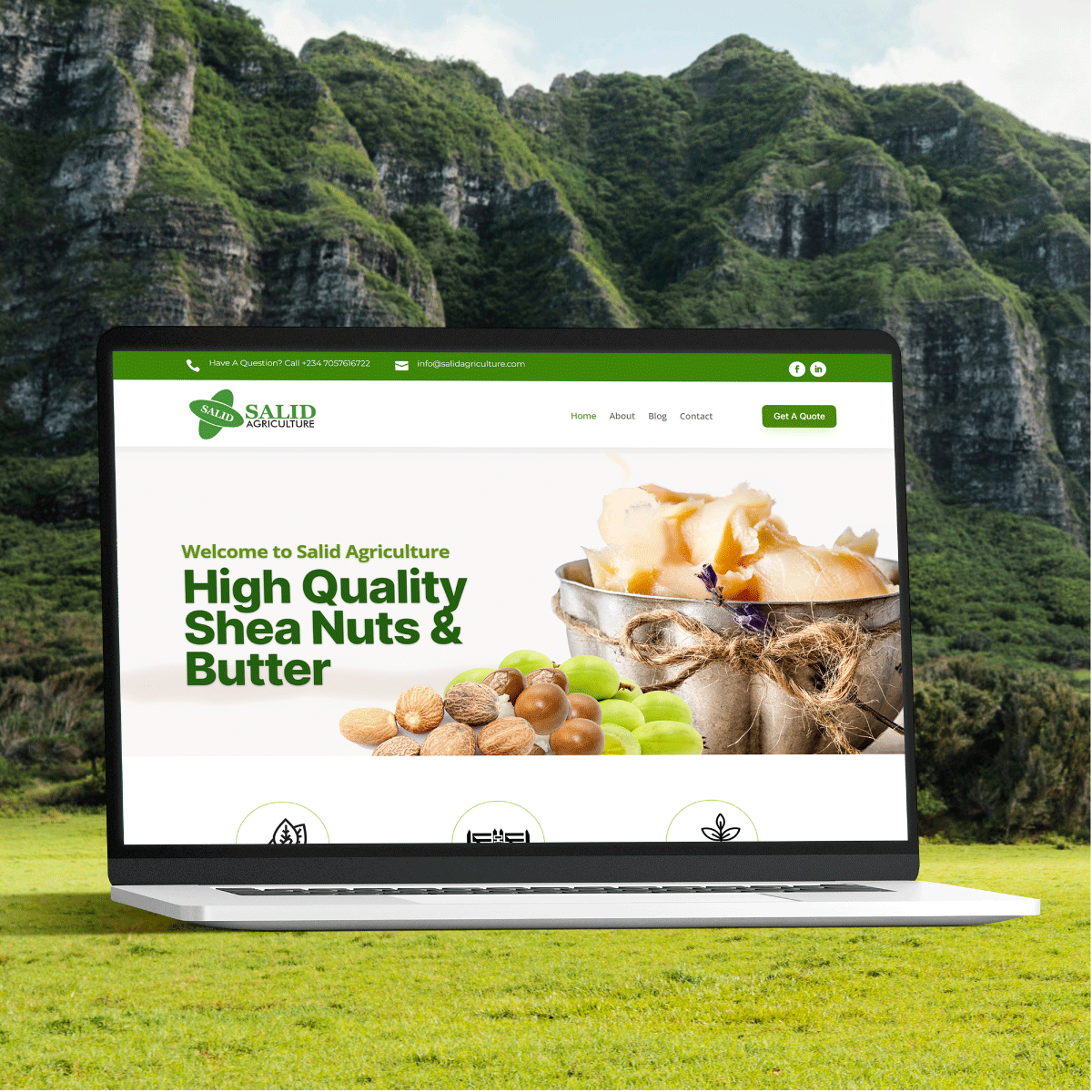
Salid Agriculture
UI/UX, Website Design
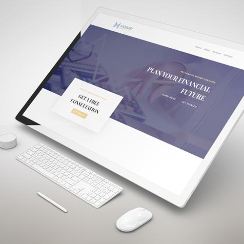
Mizmep Ventures
Branding, UI/UX, Website Design
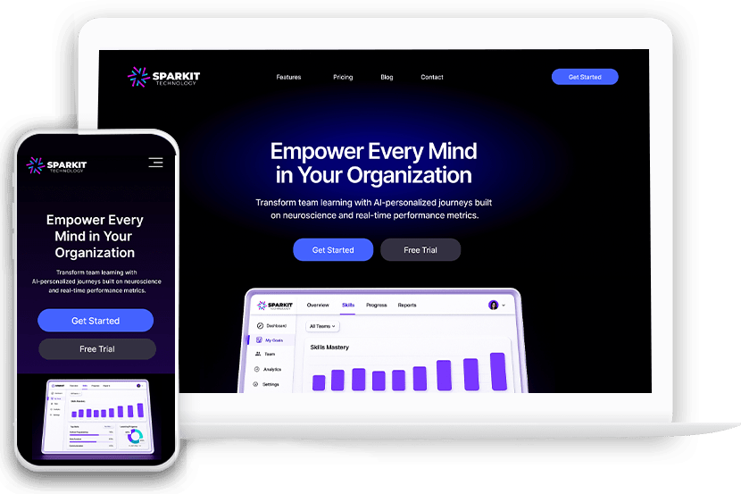
Designing Sparkit’s Landing Page for Clarity, Credibility, and Adoption
CLIENT
- Sparkit
PROJECT DURATION
- 1 Week
PLATFORM
- Desktop & Mobile
TEAM
- 1 UI/UX Designer
- 1 Web Designer
TOOL
- Figma
- Hand Sketch
- FigJam
- Adobe Photoshop
- Adobe Illustrator
Project Info
Challenge
Sparkit was a brand-new AI-powered learning platform built on neuroscience, with no existing web presence. The challenge was to design a landing page that clearly communicated a complex product, built immediate trust with enterprise users, and helped drive product trials—without overwhelming or confusing new visitors.
Solution
I crafted a clean, conversion-optimized landing page that made Sparkit’s value clear in seconds. Using scannable content blocks, future-focused visuals, and trust-building elements, the design translated deep tech into approachable benefits. The layout prioritized clarity, credibility, and smart CTAs to guide users toward starting a trial or booking a demo.
My Process
Discover & clarity
Understanding what Sparkit is, who it’s for, and what users need to know first.
Structure & Flow
Mapping the layout to guide users naturally toward understanding and action.
Visual Design
Bringing the brand to life with a modern, clean, and intelligent aesthetic.
Final Delivery
Packaging the design for launch with everything needed for a smooth build.
DISCOVER & CLARITY
I started by digging into the product vision and value proposition. Sparkit is an AI learning platform powered by neuroscience—exciting, but complex. My goal was to simplify the story: what it does, who it’s for (enterprise teams), and why it matters. I worked closely with stakeholders to surface the core message that would hook users fast and build trust.
STRUCTURE & FLOW
With clarity on the message, I moved to planning the content structure. I designed a flow that starts strong, answers questions quickly, and ends in action—hero, key benefits, features, social proof, and pricing. Every section was placed with intent to reduce friction, highlight value, and lead users toward conversion (trial or demo).
VISUAL DESIGN
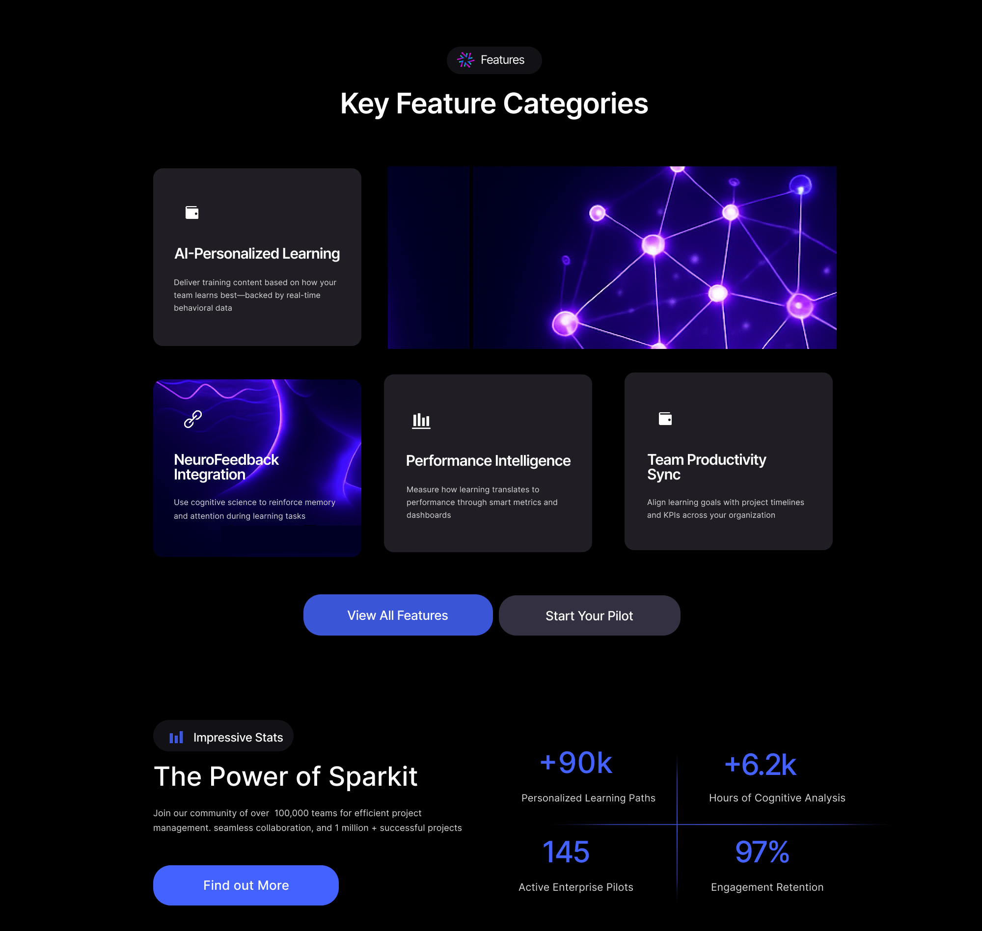
The design had to feel innovative but not intimidating. I used a soft dark UI with vibrant accent colors, custom illustrations (like neural maps and AI dashboards), and smooth spacing to make the experience feel focused and elevated. The visuals balanced tech-forward ambition with clear, user-friendly interface elements.
Style & Imagery

#C5C5D1

#C5C5D1

#C5C5D1

#C5C5D1

#C5C5D1
Aa
Inter Semibold 32pt
Inter Regular 24pt
Inter Regular 16pt
Inter Bold 14pt
We chose Inter for its high readability and modern aesthetic. Its geometric clarity and wide weight range make it ideal for both headings and body text across digital interfaces. The type scale balances visual hierarchy with clean spacing, ensuring content remains legible and accessible on all devices.
UI Blocks
Final Delivery
I delivered a polished, dev-ready design with clear documentation on layout, interactions, and assets. Everything was set up for easy handoff and scalable use as Sparkit grows. The final result: a landing page that builds confidence, communicates value quickly, and drives action from its very first users.

View Figma File
Main Pages
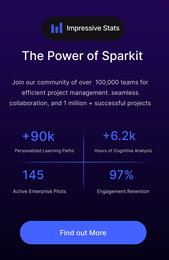
The newly designed landing page for Sparkit focused on simplifying a complex product through clarity, trust-building, and visual storytelling. The homepage introduces Sparkit’s core value—AI-powered learning rooted in neuroscience—while showcasing key features, success metrics, and flexible pricing plans. A modular layout ensures consistency and future scalability, and the visual design blends intelligence with approachability. Special attention was given to clean navigation, mobile responsiveness, and clear CTAs to engage enterprise users, team leads, and early adopters.
OUTCOME
MVP launch attracted 12 enterprise signups in 30 days with a 36% conversion from landing to demo request.
Redesigning Salid Agriculture’s Website for Trust, Clarity, and Growth
CLIENT
- Salid Agriculture
PROJECT DURATION
- 2 Weeks
PLATFORM
- Desktop & Mobile
TEAM
- 1 UI/UX Designer
- 1 Web Designer
TOOL
- Figma
- Hand Sketch
- FigJam
- Adobe Photoshop
- Adobe Illustrator
Project Info
Challenge
Salid Agriculture’s website lacked structure, clarity, and modern design. It failed to communicate the brand’s social impact and credibility, making it difficult for partners and investors to engage or trust the business online.
Solution
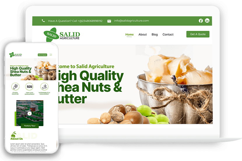
I redesigned the site with a clean, responsive layout, strengthened the brand’s voice through clearer messaging, and showcased key impact metrics and team credibility. The result is a trustworthy, user-friendly platform that supports engagement and growth.
My Process
Discover
Conducted a visual and content audit, reviewed competitors, and interviewed stakeholders to understand the goals and gaps in the old site.
Strategize
Mapped content hierarchy, defined UX goals, and aligned visual direction with the client’s brand, values, and audience needs.
Design
Created wireframes and high-fidelity UI screens using Figma, focusing on structure, clarity, and mobile responsiveness.
Deliver
Prepared final UI assets with annotated specs and collaborated closely with the development team to ensure design accuracy and implementation consistency.
AUDIT & RESEARCH
-
Visual Audit: Unaligned elements, inconsistent fonts, low-res images.
-
Content Audit: No clear hierarchy, too much text in wrong places.
-
Competitive Research: Compared with similar agribusiness brands in Africa and globally.
-
Client Interviews: Identified key business goals — trust, social impact, investor confidence.
UX GOALS
| Goal | UX Solution |
|---|---|
| Build trust | Hero section with strong imagery & impact stats |
| Tell the brand story | Clear “About Us” section and video feature |
| Humanize the business | Highlighted director profiles with images |
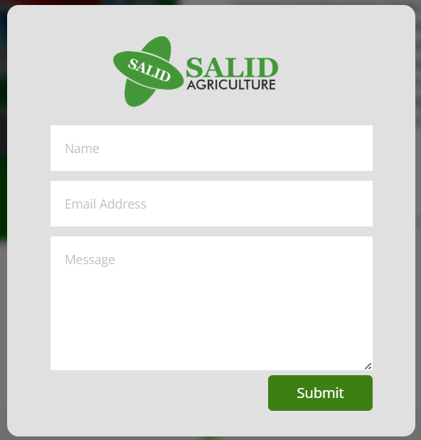
| Increase engagement | Repeated “Get a Quote” CTA and clear contact info |
| Simplify navigation | Clean header with sticky nav and intuitive sections |
UI IMPROVEMENTS
-
Visual Identity: Unified color palette (greens, naturals) and consistent fonts
-
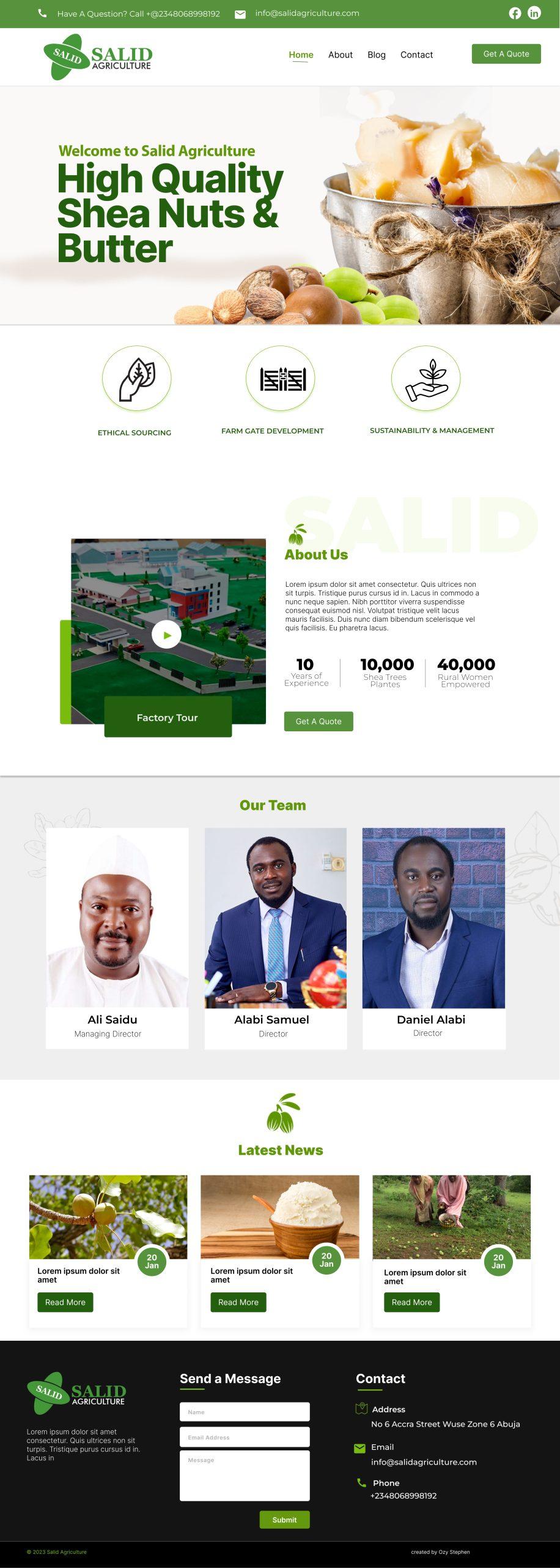
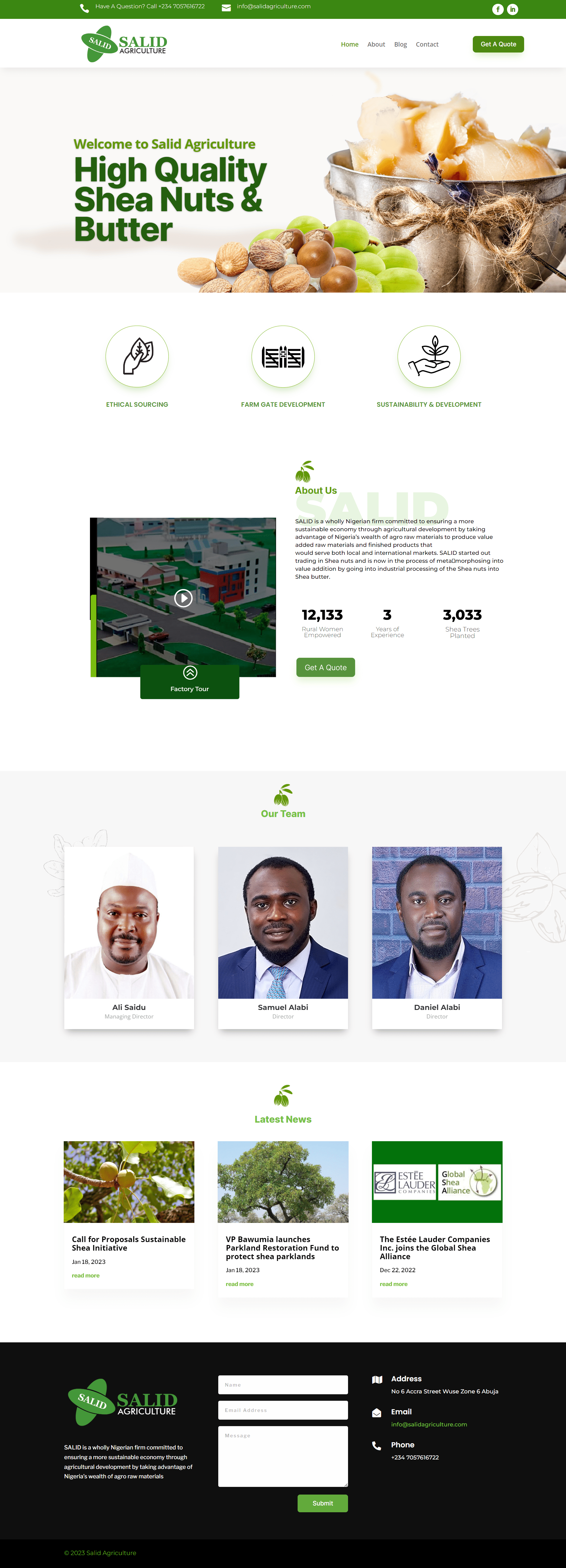
Hero Banner: High-quality shea butter image and bold headline for instant message clarity
-
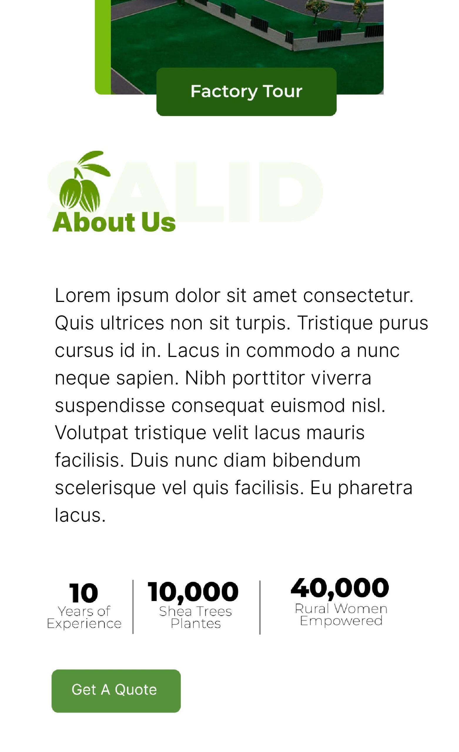
Impact Metrics: 10,000 trees, 40,000 women — made prominent below About section
-
Team Section: Added professional headshots and titles for trust
-
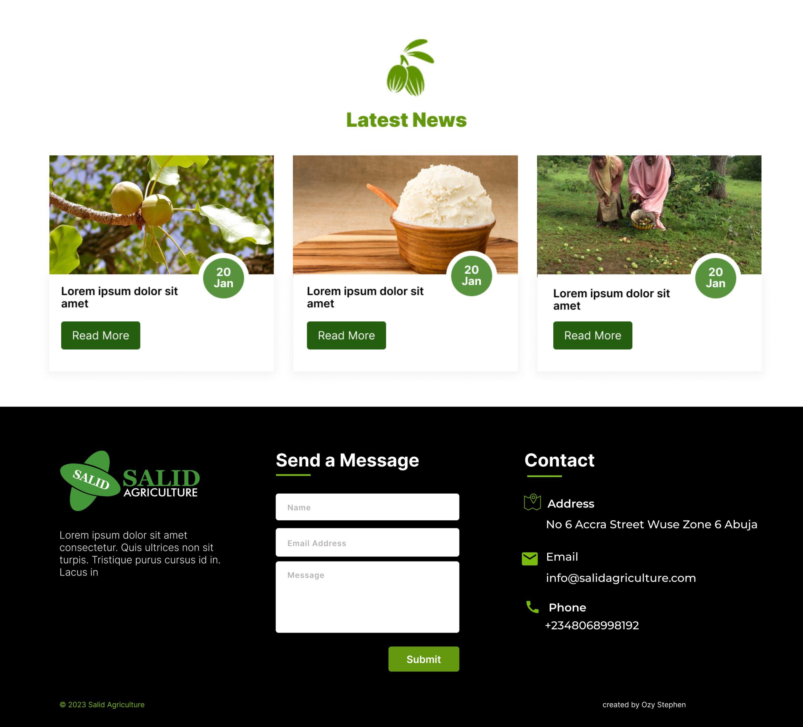
Latest News: Modular layout to support updates and SEO
Style & Imagery

#C5C5D1

#C5C5D1

#C5C5D1

#C5C5D1



Aa
Inter Semibold 32pt
Inter Regular 24pt
Inter Regular 16pt
Inter Bold 14pt
We chose Inter for its high readability and modern aesthetic. Its geometric clarity and wide weight range make it ideal for both headings and body text across digital interfaces. The type scale balances visual hierarchy with clean spacing, ensuring content remains legible and accessible on all devices.
UI Blocks
DELIVERY: READY FOR DEVELOPMENT
-
High-Fidelity Designs: I finalized polished UI screens aligned with Paywise’s design system, optimizing for enterprise scalability and accessibility.
-
Developer Handoff: Delivered annotated designs and interaction specs via Figma and Zeplin. Also supported QA to ensure design integrity in implementation.

View Figma File
Main Pages
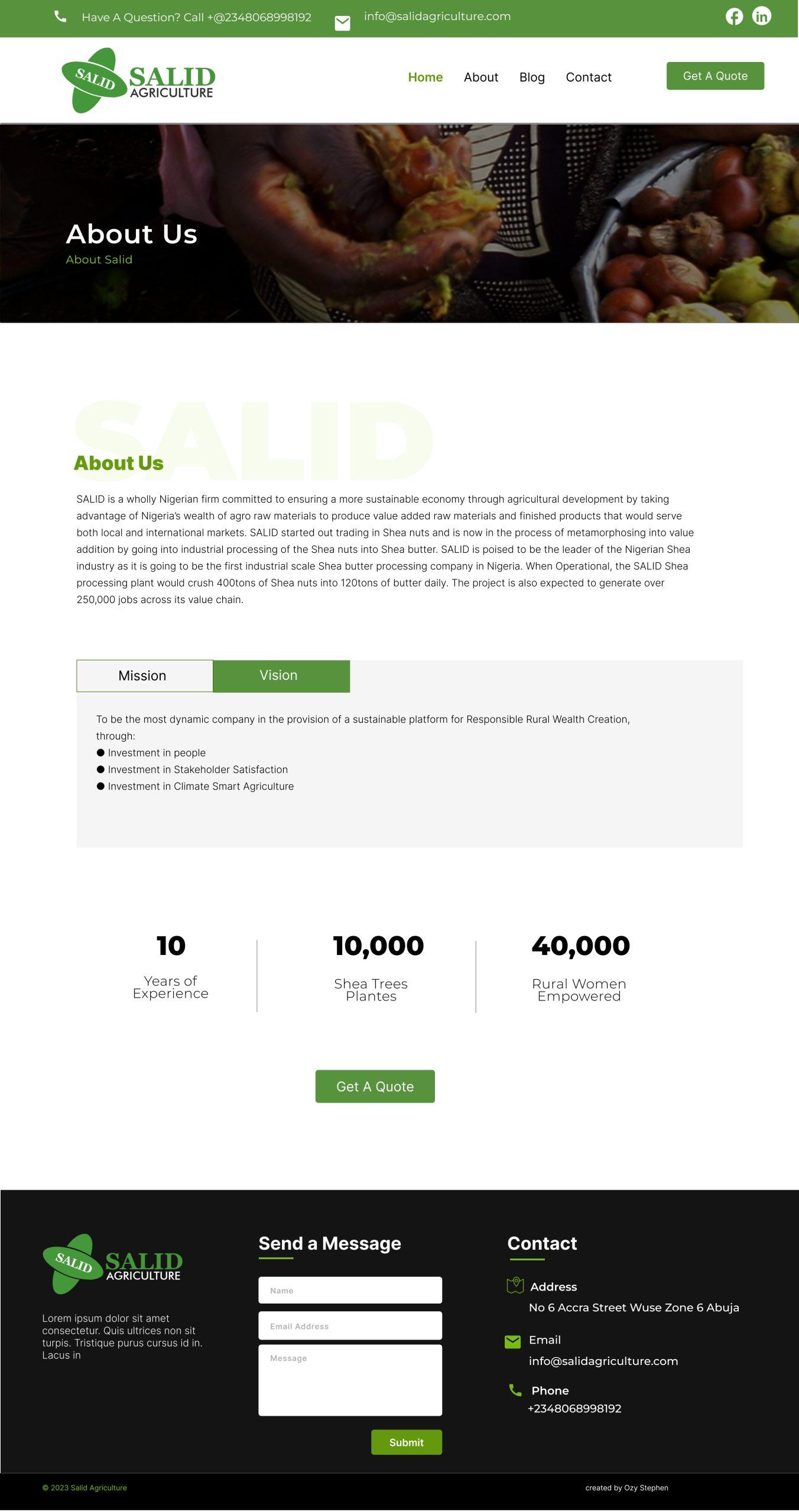
The redesigned pages focused on clarity, trust, and storytelling. The homepage highlights Salid’s mission, impact metrics, and key services, while the About page introduces the team and emphasizes the company’s credibility. A modular layout structure was used across all pages to ensure consistency and scalability. Special attention was given to mobile responsiveness and clean navigation to make the site accessible and engaging for all user types—investors, partners, and local stakeholders.
IMPACT
-
Implemented the design using Divi with responsive behavior
-
Made sure images scale well across desktop and mobile
-
Delivered easy-to-edit modules so client could manage content without dev support
From Vision to Identity: Launching the Daisies Pride School Brand
CLIENT
- Daisies Pride School
INDUSTRY
- Education
What i did
- Brand Identity
- Graphic Design
- Packaging & Labels
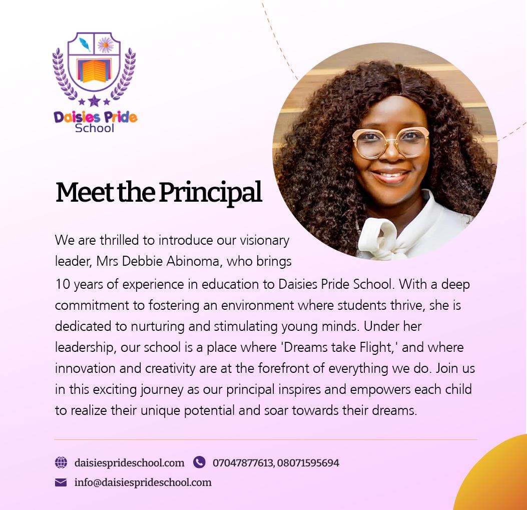
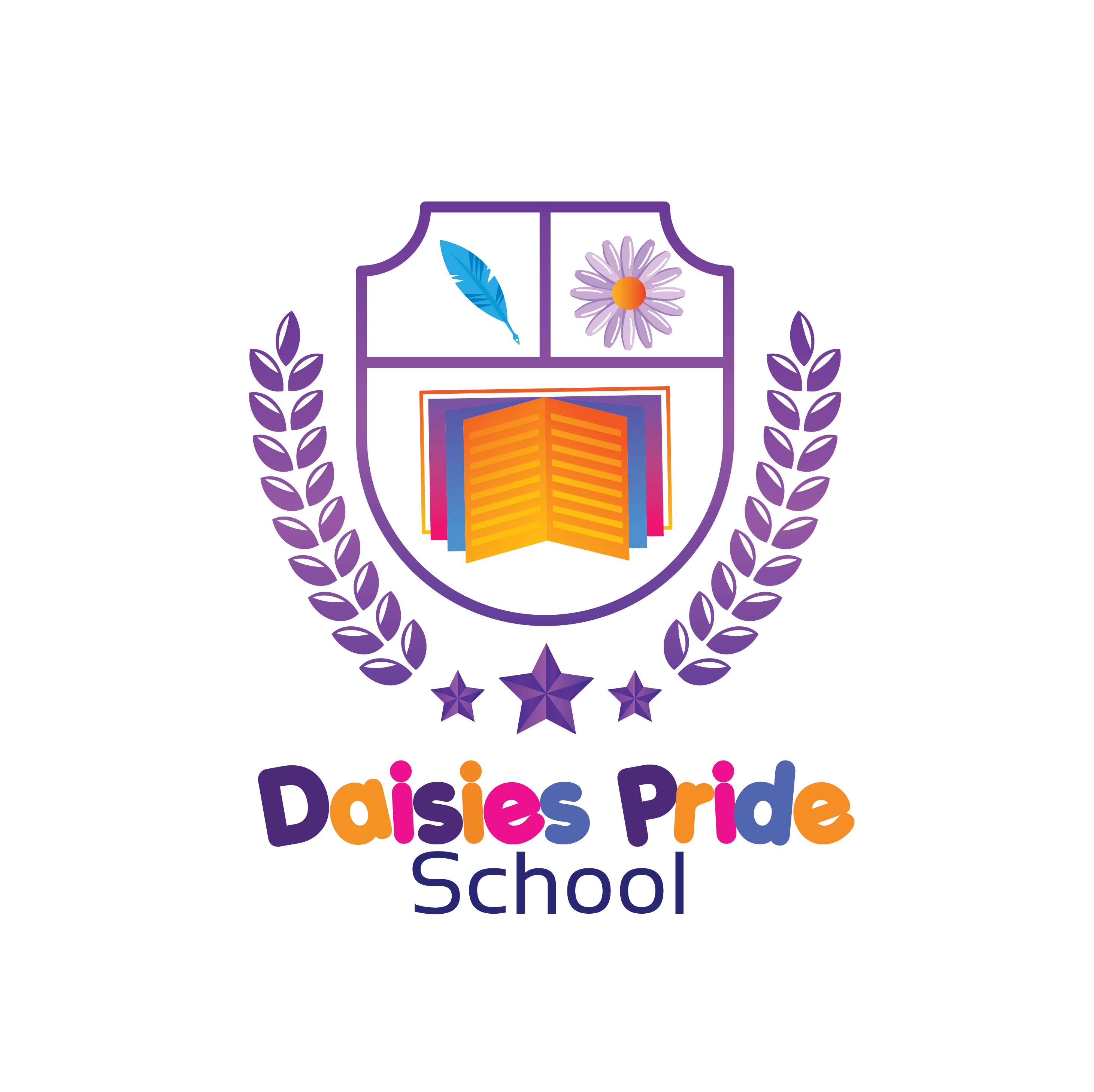
Daisies Pride School approached us with a vision to establish a strong, memorable brand for their new educational institution. We partnered with them to bring this vision to life by designing a distinctive logo, developing a modern website, and crafting comprehensive startup brand materials. Our work set the foundation for Daisies Pride School to make a lasting impression in the community and build a brand that resonates with students and parents alike.
LOGO
Typography
Aa
Porky’s
ABCDEFGHIJKLMNOPQRSTUVWXYZ
abcdefghijklmnopqrstuvwxyz
0123456789
Colors

WEBSITE

MARKETING DESIGNS
Building Dreams: Hennes Homes Brand & Digital Transformation
CLIENT
- Hennes Homes
INDUSTRY
- Real Estate
What i did
- Brand Identity
- Graphic Design
- Website Design
For this project, I partnered with Hennes Homes, a dynamic real estate company, to create a compelling brand identity and digital experience. My work involved designing a modern, trustworthy visual identity and developing a user-friendly, responsive website. The project was aimed at elevating Hennes Homes’ online presence, showcasing their properties, and enhancing client engagement, ultimately positioning them as a standout player in the real estate market.
LOGO

MARKETING DESIGNS

Enhancing Cyber Resilience: Cybergemba Brand & Digital Strategy
CLIENT
- Cybergemba Limited
INDUSTRY
- Information Technology
What i did
- Website Design
- Email Marketing
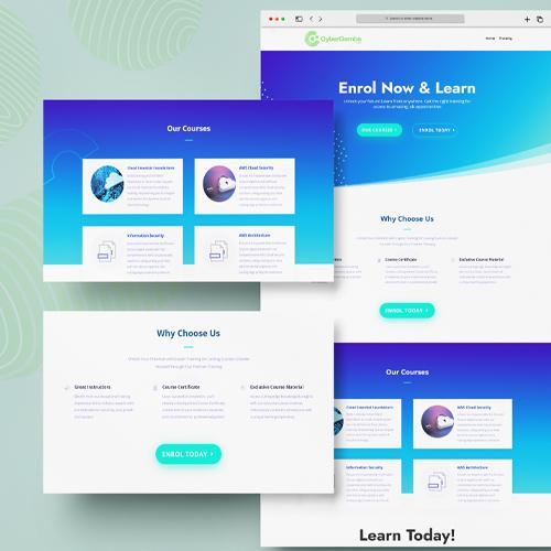
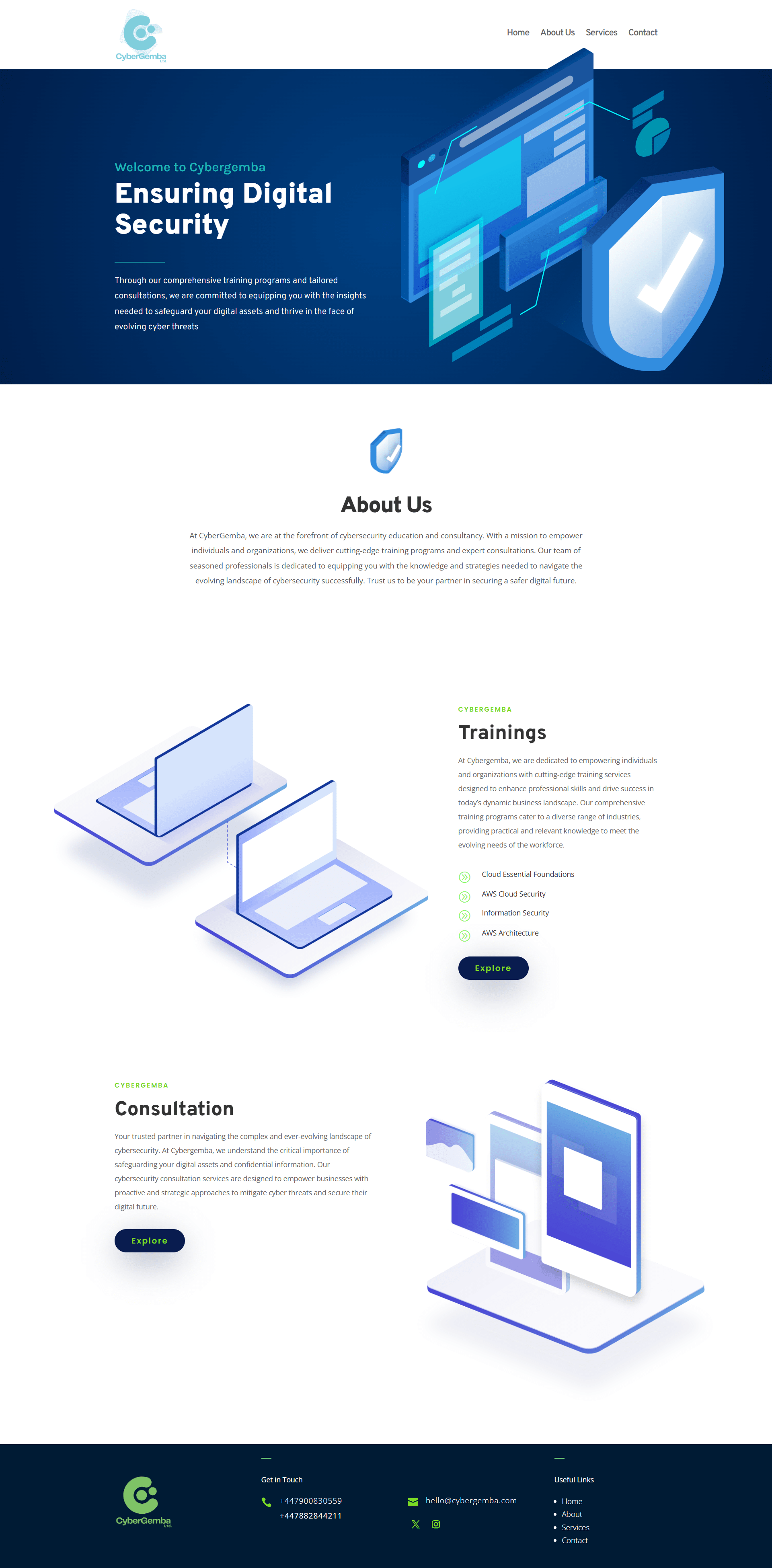
For Cybergema, a cybersecurity training and consultation company, I developed a comprehensive brand and digital strategy to elevate their online presence and communication. This project involved designing a modern, tech-forward website and creating a dynamic email marketing campaign.
The responsive website features intuitive navigation, bold visuals, and a clean layout that underscores Cybergema’s expertise in cybersecurity solutions and training programs. I also designed an email marketing strategy tailored to engage B2B clients, focusing on clear messaging and actionable insights.
The combined efforts reinforced Cybergema’s position as a trusted partner in cybersecurity, equipping businesses to safeguard their digital infrastructure in an ever-evolving threat landscape.
WEBSITE
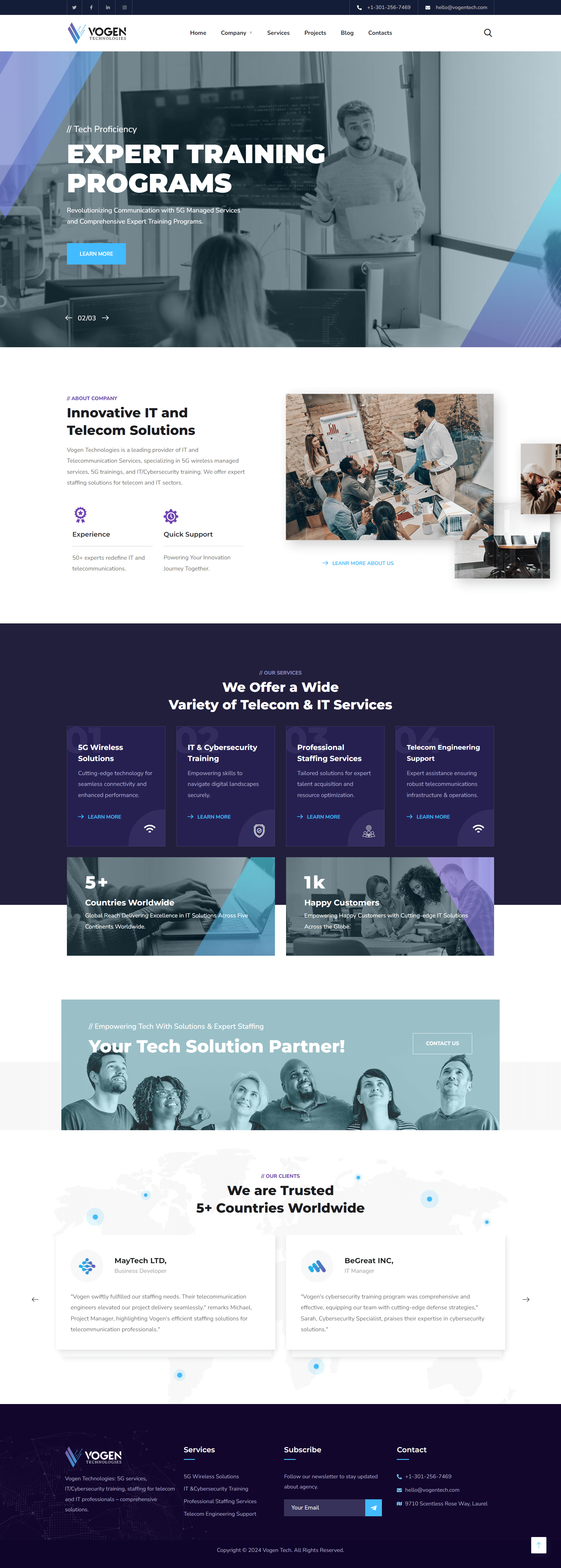
Shaping the Future: Vogen Technologies Brand & Digital Experience
CLIENT
- Vogen Technologies
INDUSTRY
- Technology
What i did
- Brand Identity
- Website Design
LOGO

WEBSITE
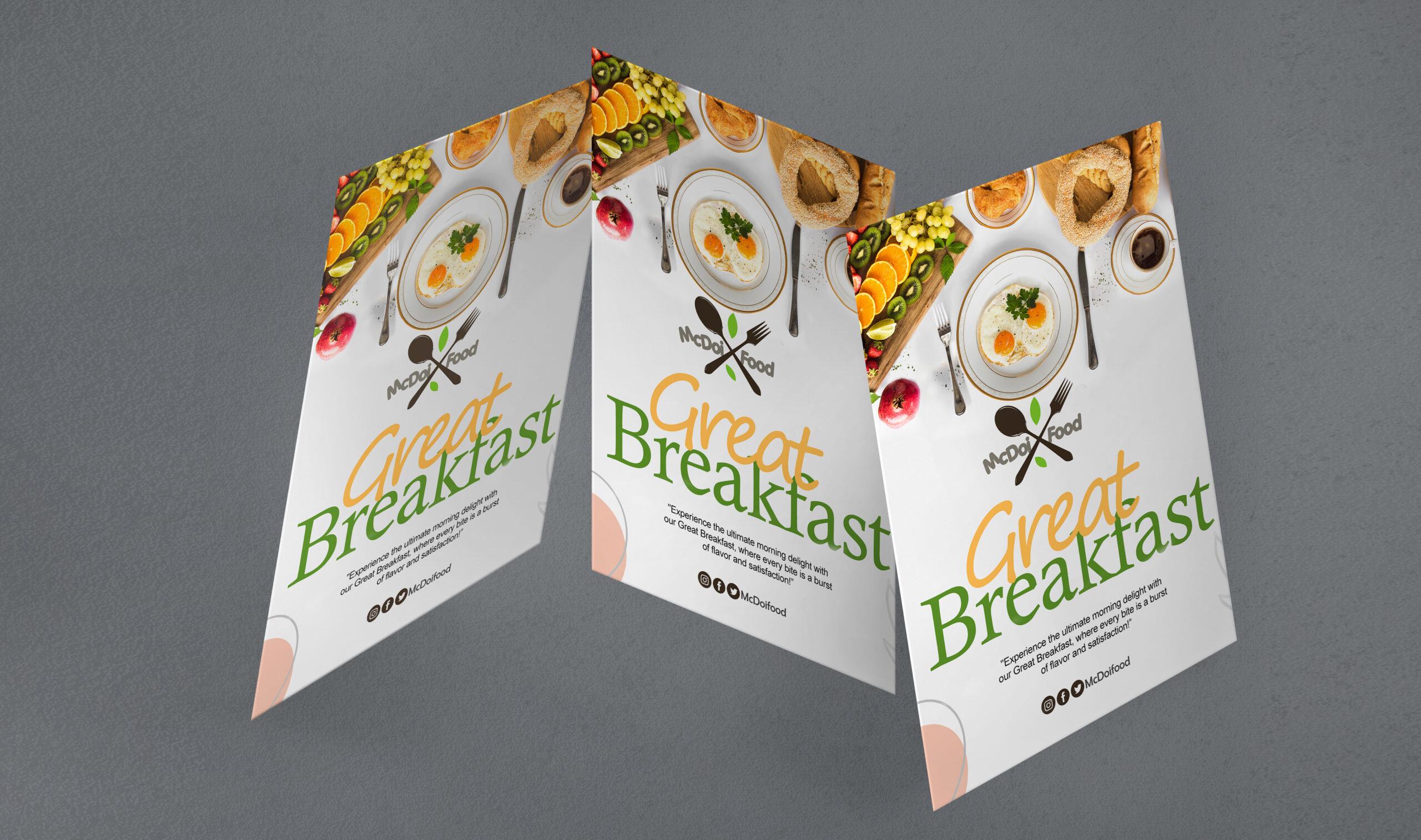
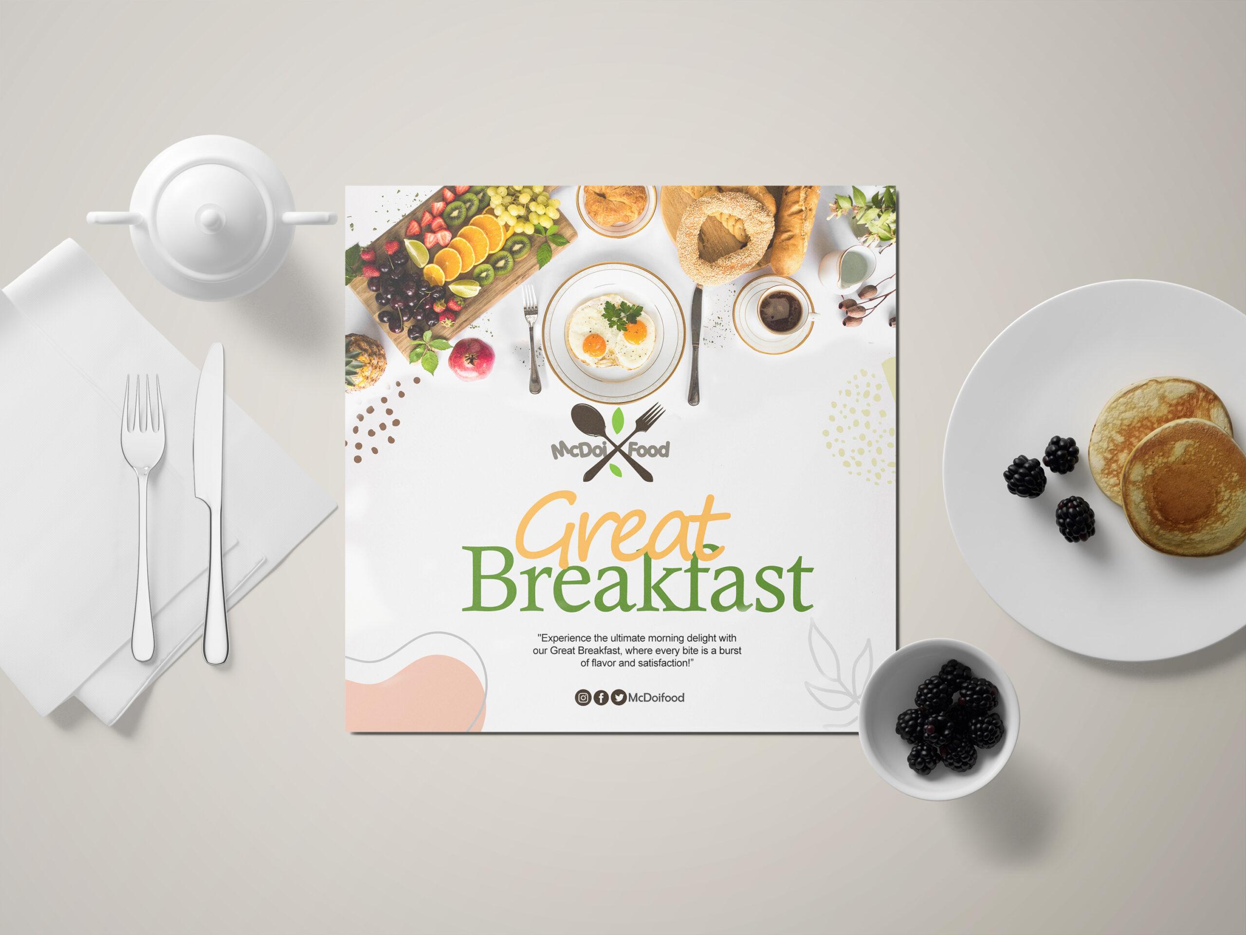
CLient
McDoi Food
INDUSTRY
- Food
What I did
- Brand Identity
- Graphic Design
Website
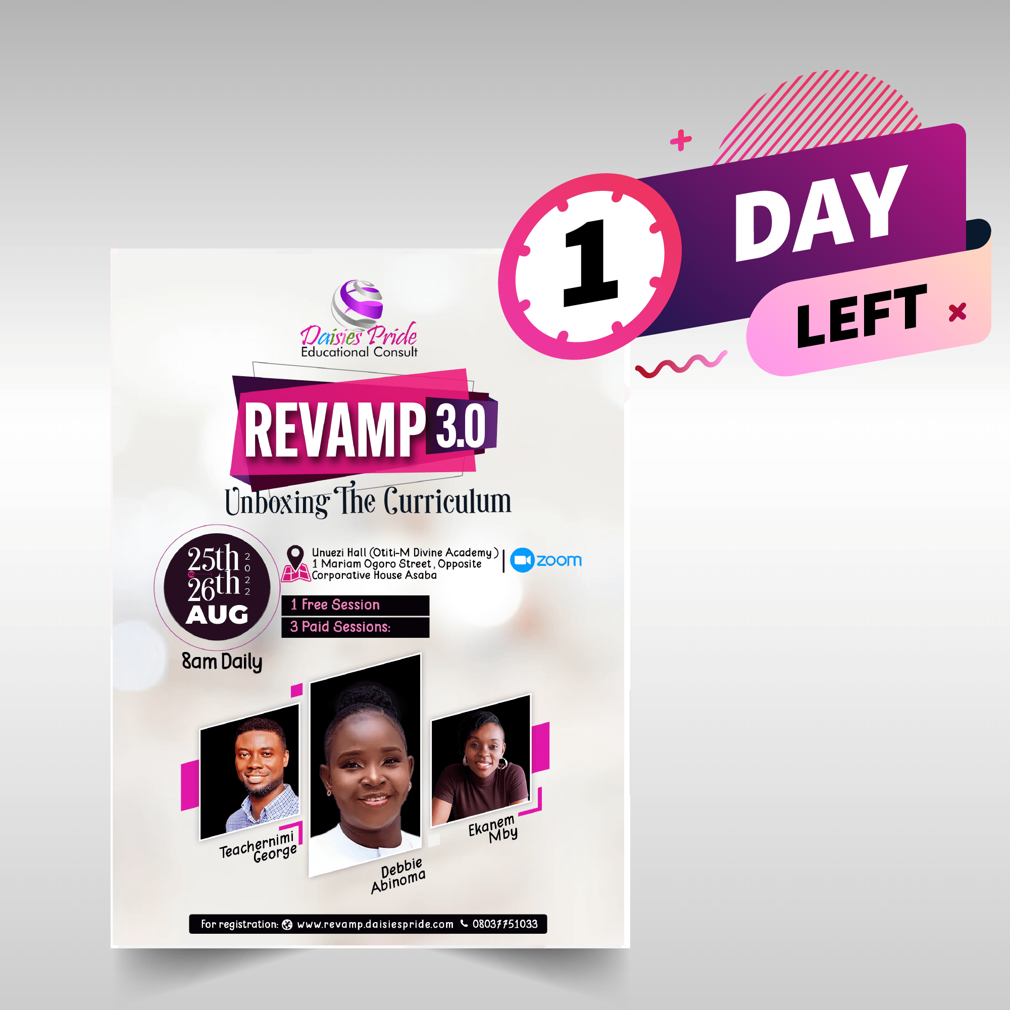
CLient
DaisiesPride Educational
INDUSTRY
- Education
What I did
- Graphic Design
- Landing Page
- Digital Marketing
Website

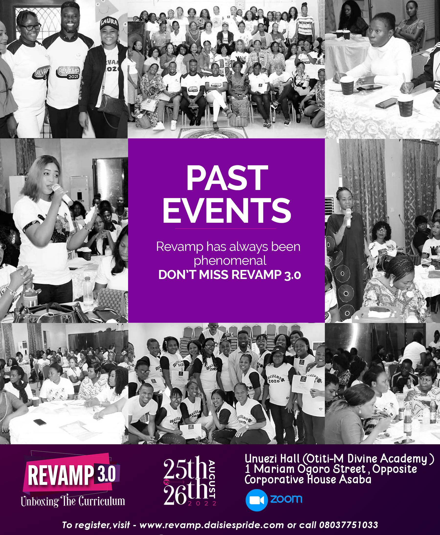

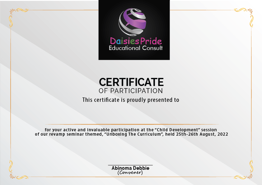
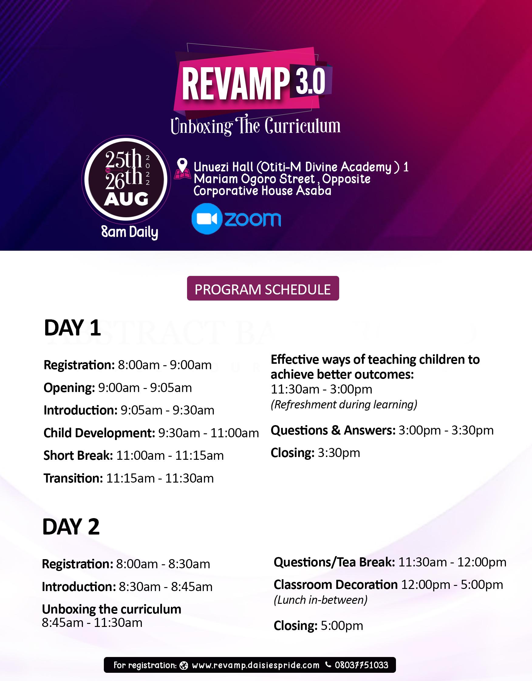

CLIENT
- Salid Agriculture
INDUSTRY
- Agriculure
What WE did
- Website
- Graphics
For Salid Agriculture, I spearheaded a complete website redesign aimed at enhancing their online presence. The project involved creating a fresh, modern, and user-friendly interface that reflects their commitment to innovation in agriculture. By improving the site’s navigation, visual appeal, and functionality, the redesign effectively showcases Salid’s agricultural expertise and strengthens their connection with clients and partners.
WEBSITE
CLient
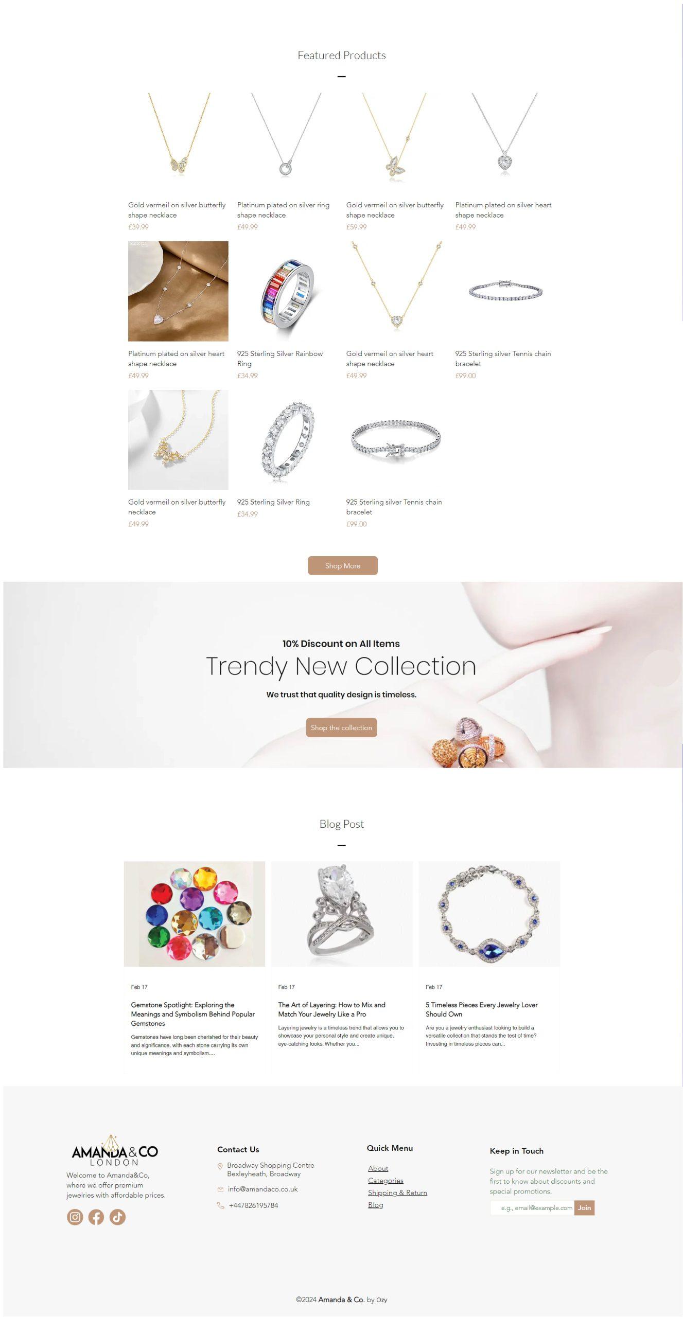
Amanda & Co London
INDUSTRY
- Fashion
What I did
- Brand Identity
- UI/UX
- Website Design
- Graphic Design
Website
Style & Imagery

Style & Imagery
Aa
Arial
ABCDEFGHIJKLMNOPQRSTUVWXYZ
abcdefghijklmnopqrstuvwxyz
0123456789

#BF9477

#000000

#FFFFFF

#CDAA92

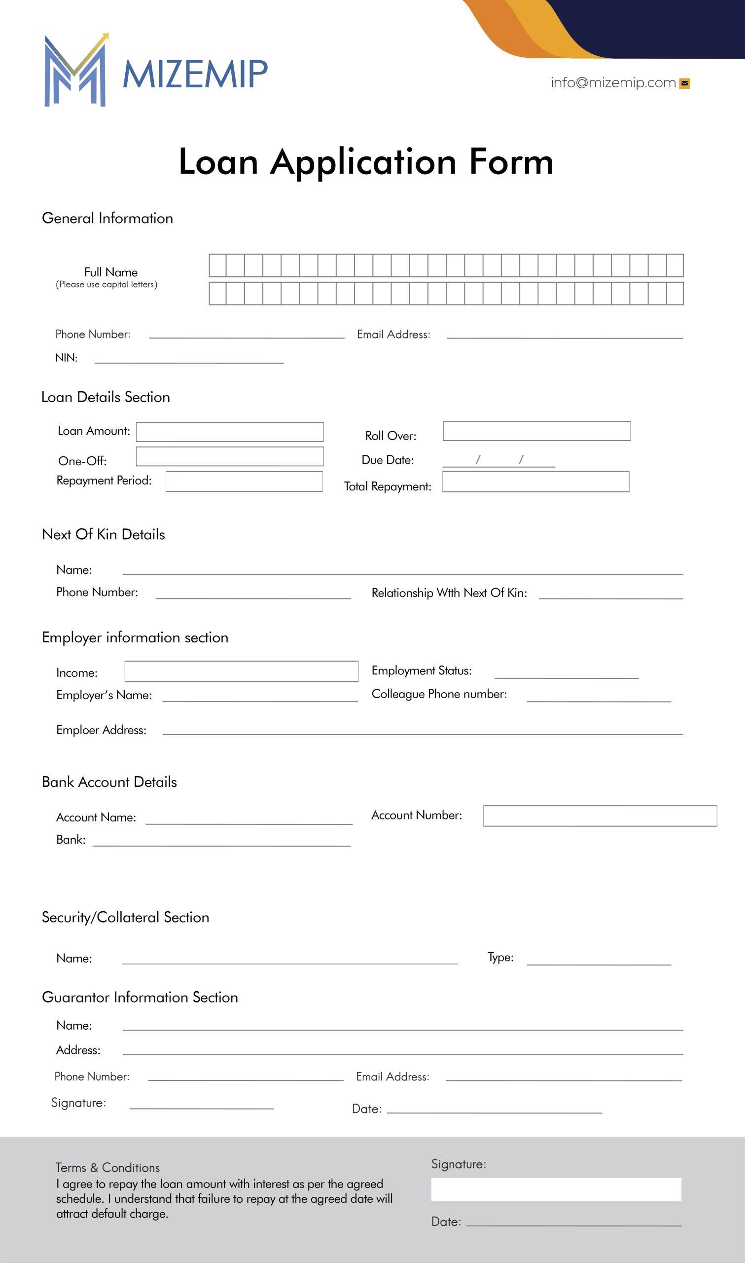
Transforming Mizemip: Innovative Brand Identity & Digital Design for Financial Excellence
CLIENT
- Mizemep
INDUSTRY
- Finance
What i did
- Brand Identity
- UI/UX
- Website Design
- Graphic Design
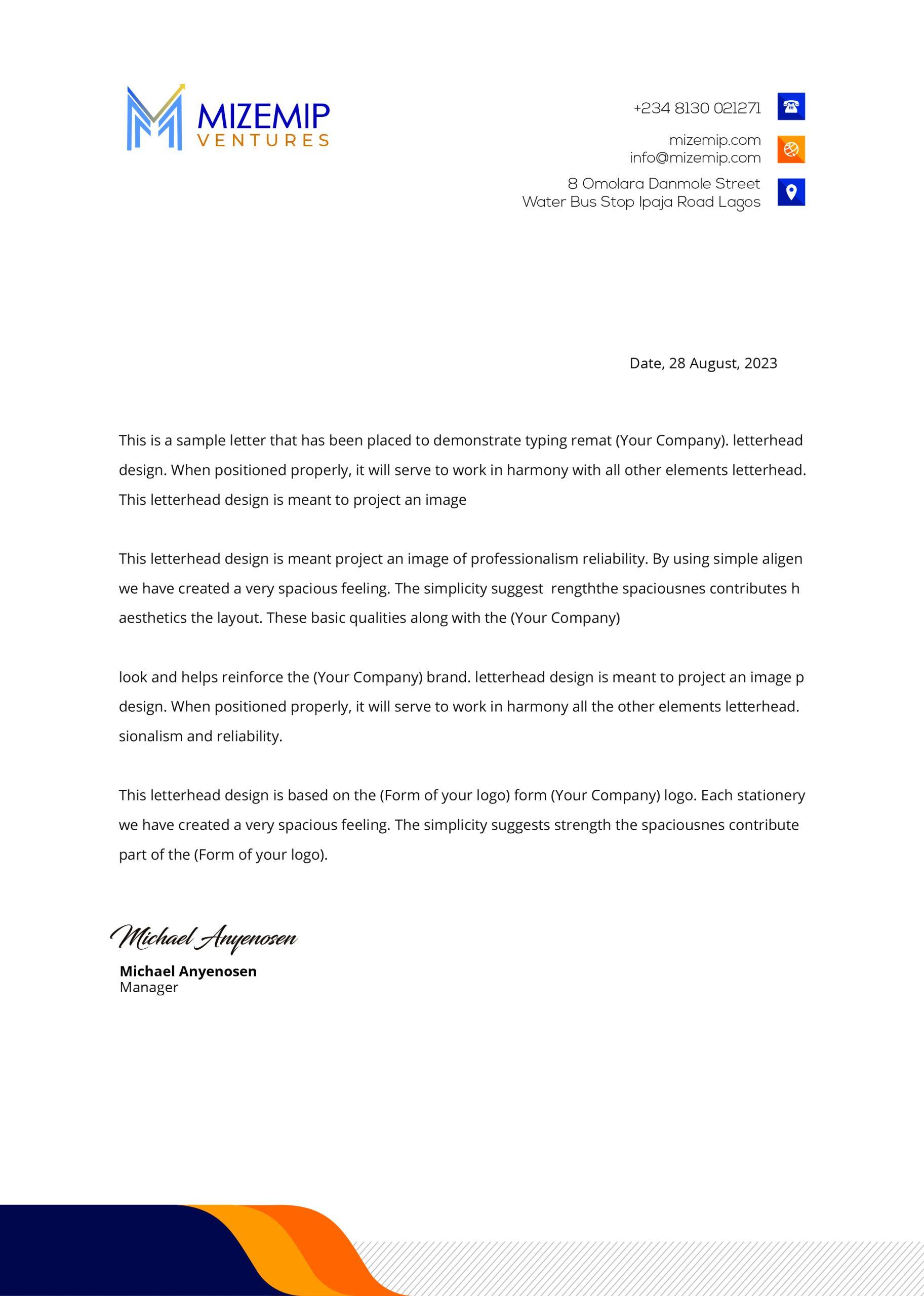
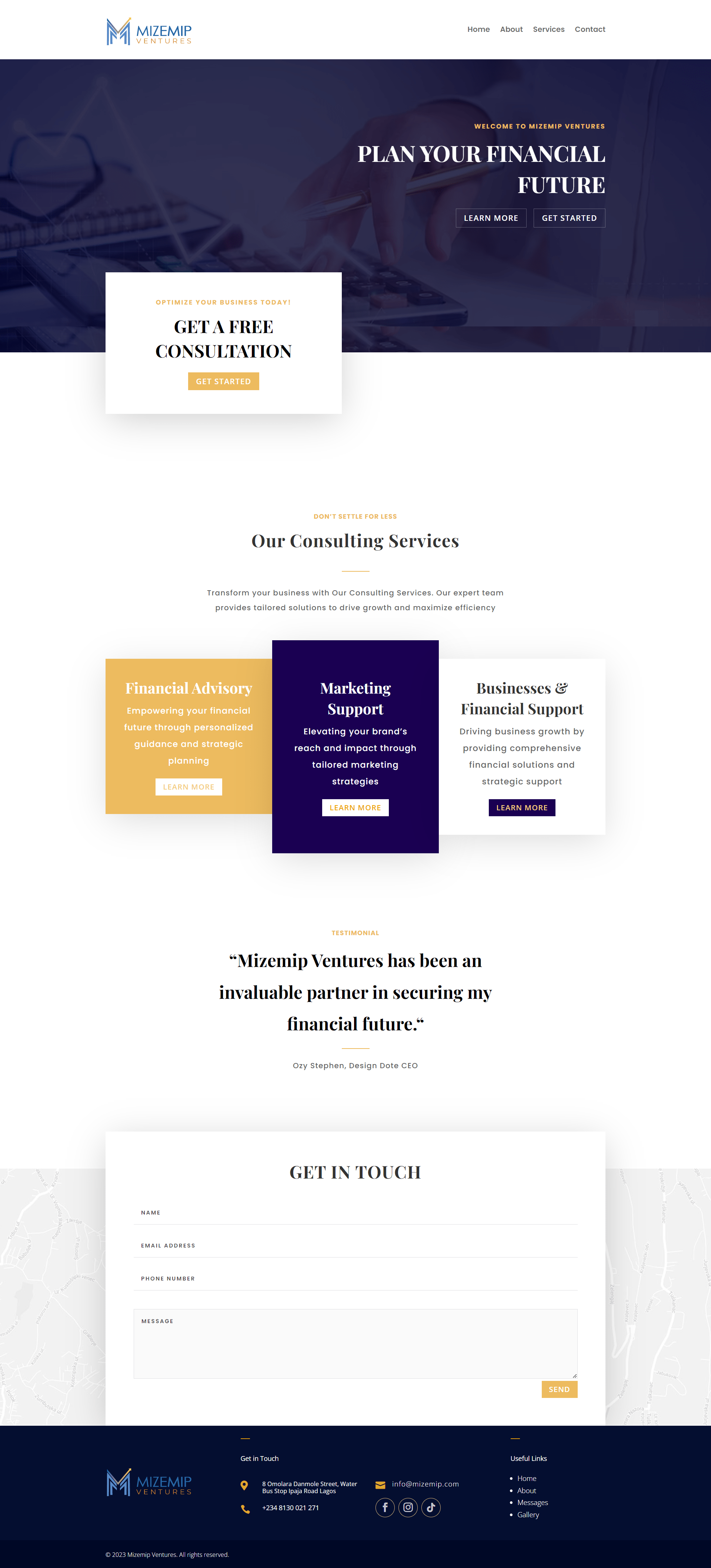
For Mizemip, a standout in the finance sector, we developed a compelling brand identity and cutting-edge digital experience. Our work includes a sleek, modern logo, intuitive UI/UX design, and a visually engaging website. This holistic design approach not only elevates Mizemip’s market presence but also enhances user interaction, making a strong impact in the competitive financial arena.
LOGO
Typography
Aa
Century Gothic
ABCDEFGHIJKLMNOPQRSTUVWXYZ
abcdefghijklmnopqrstuvwxyz
0123456789
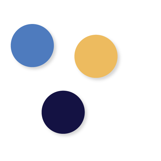
Colors
WEBSITE
MARKETING DESIGNS
CLIENT
- Nature’s Delight Juices
INDUSTRY
- Food and Beverage
What WE did
- Branding
- Packaging & Labels
- Printing
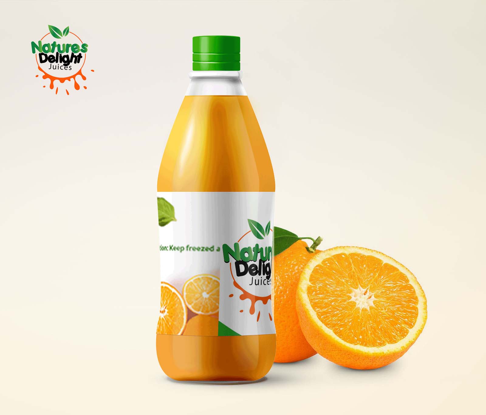
Natures Delight Juices partnered with us to refresh their brand with a new logo and packaging label. We crafted a vibrant and eye-catching design that captures the essence of their natural, refreshing juices. The updated branding not only enhances shelf appeal but also strengthens Natures Delight’s connection with health-conscious consumers.
LOGO
Typography
Aa
Porky’s
ABCDEFGHIJKLMNOPQRSTUVWXYZ
abcdefghijklmnopqrstuvwxyz
0123456789
Colors
PACKAGING LABEL
CLIENT
- Nature’s Delight Juices
INDUSTRY
- Food and Beverage
What i did
- Branding
- Packaging & Labels
- Printing
Natures Delight Juices partnered with us to refresh their brand with a new logo and packaging label. We crafted a vibrant and eye-catching design that captures the essence of their natural, refreshing juices. The updated branding not only enhances shelf appeal but also strengthens Natures Delight’s connection with health-conscious consumers.
LOGO

Typography
Aa
Porky’s
ABCDEFGHIJKLMNOPQRSTUVWXYZ
abcdefghijklmnopqrstuvwxyz
0123456789
Colors

PACKAGING LABEL

CLient
Imagesmith Studios
Style & Imagery
Aa
Montserrat
ABCDEFGHIJKLMNOPQRSTUVWXYZ
abcdefghijklmnopqrstuvwxyz
0123456789

#18C9E0

#000000

#FFFFFF
CLient
- Amanada & Co London
Services
- Web design
- UI / UX
- Logo Redesign
Deliverables
- 12 Pages
- Illustrations
- Icons
- Styleguide
- WordPress Build
Other
- SEO
- Analytics
- Social Media
Website
Project Info
Vivamus suscipit tortor eget felis porttitor volutpat. Donec rutrum congue leo eget malesuada. Lorem ipsum dolor sit amet, consectetur adipiscing elit. Praesent sapien massa, convallis a pellentesque nec, egestas non nisi. Lorem ipsum dolor sit amet, consectetur adipiscing elit. Praesent sapien massa, convallis a pellentesque nec, egestas non nisi. Cras ultricies ligula sed magna dictum porta.
Challenge
Vivamus magna justo, lacinia eget consectetur sed, convallis at tellus. Donec rutrum congue leo eget malesuada. Vestibulum ac diam sit amet quam vehicula elementum sed sit amet dui. Curabitur non nulla sit amet nisl tempus Vivamus magna justo, lacinia eget consectetur sed, convallis at tellus. Donec rutrum congue leo eget malesuada. Vestibulum ac diam sit amet quam vehicula elementum sed sit amet dui. Curabitur non
Solution
Vivamus magna justo, lacinia eget consectetur sed, convallis at tellus. Donec rutrum congue leo eget malesuada. Vestibulum ac diam sit amet quam vehicula elementum sed sit amet dui. Curabitur non nulla sit amet nisl tempus Vivamus magna justo, lacinia eget consectetur sed, convallis at tellus. Donec rutrum congue leo eget malesuada. Vestibulum ac diam sit amet quam vehicula elementum sed sit amet dui. Curabitur non nulla sit ame
Style & Imagery

#C5C5D1

#8585BD

#2E2545

#09E1C0

#7272FF
Aa
Poppins Semibold 32pt
Poppins Regular 24pt
Poppins Regular 16pt
Poppins Bold 14pt
Vestibulum ante ipsum primis in faucibus orci luctus et ultrices posuere cubilia Curae; Donec velit neque, auctor sit amet aliquam vel, ullamcorper sit amet ligula. Cras ultricies ligula sed magna dictum porta. Mauris blandit aliquet elit, eget tincidunt nibh pulvinar a. Sed lectus nibh.
Main Pages
Nullam quis risus eget urna mollis ornare vel eu leo. Vivamus sagittis lacus vel augue laoreet rutrum faucibus dolor auctor. Nullam id dolor id nibh ultricies vehicula ut id elit. Nullam quis risus eget urna mollis ornare vel Nullam quis risus eget urna mollis ornare vel eu leo. Vivamus sagittis lacus vel augue laoreet rutrum faucibus dolor auctor. Nullam id dolor id nibh ultricies vehicula ut id elit. Nullam quis risus eget urna mollis ornare vel Nullam quis risus eget urna mollis ornare vel eu leo. Vivamus sagittis lacus vel augue laoreet rutrum fauci
Client
Salid Agriculture Limited
Deliverables
UX Design & Research
UI Design
Website Design
Project Info
Salid Agriculture, a distinguished B2B shear butter producer, sought our expertise to overhaul their company website after encountering limitations with its original Wix setup. Tasked with rebuilding the site, our team embarked on a journey to redefine its UI/UX experience. By infusing the essence of Salid Agriculture’s brand identity into the visual design, we crafted a website that exuded elegance and professionalism. Seamlessly integrating captivating imagery and intuitive navigation, we ensured that visitors could understand the company’s commitment to sustainability. With our implementation expertise, the website now stands as a testament to Salid Agriculture’s dedication to quality and serves as a powerful B2B tool, enabling seamless transactions and fostering lasting partnerships
Tools
Figma
WordPress
Divi
Discovery
Research Goals
Find out what kind of businesses use shear butter
Find out kind of enquiry prospsctive clients will make
Interviews
UX Design & Research
UI Design
Website Design
Define
Persona
Salid Agriculture Limited
User Flow
Salid Agriculture Limited
Task Flow
Salid Agriculture Limited
Sketches
Salid Agriculture Limited
Design
High Fidelity Prototype
Salid Agriculture Limited
Usability Testing
Salid Agriculture Limited
Priority Revisions
Salid Agriculture Limited
© 2024 Ozy Stephen. All rights reserved.
Privacy Policy
